UI Component Library - Free HTML/CSS Templates
Browse our high-fidelity library of responsive HTML/CSS components, from glassmorphic navbars to neumorphic UI elements.
Inline Table
An ultra-slim data grid designed for use inside cards, tooltips, or small content containers.
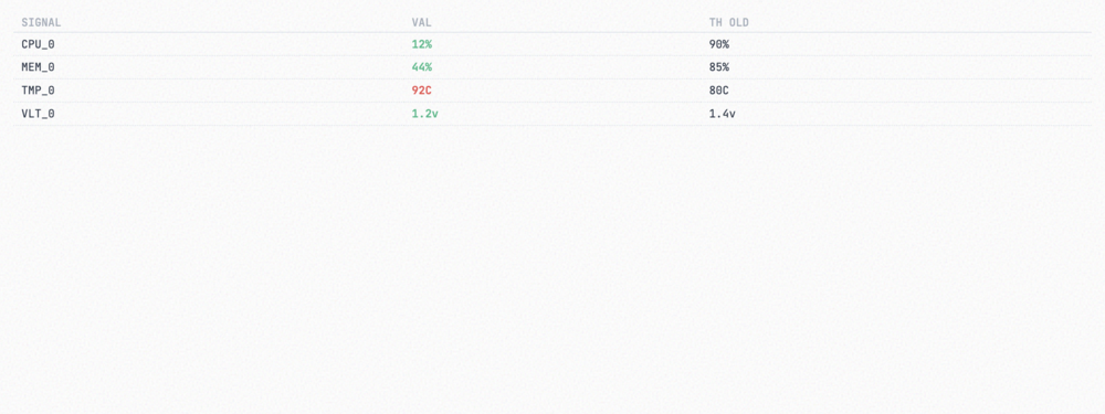
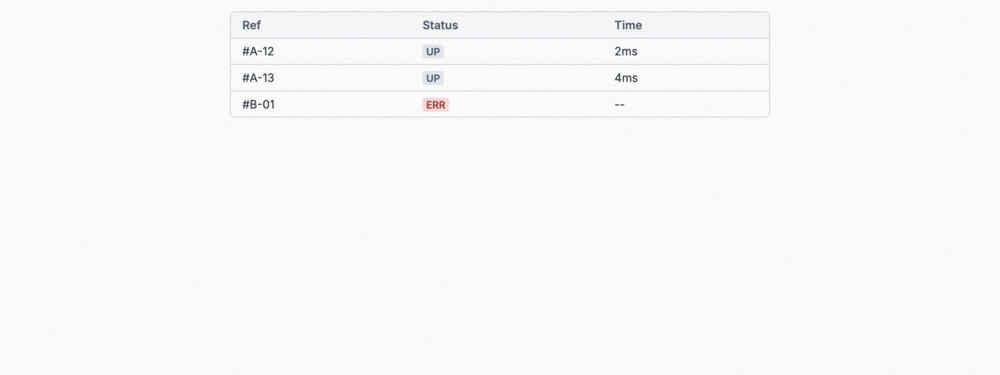
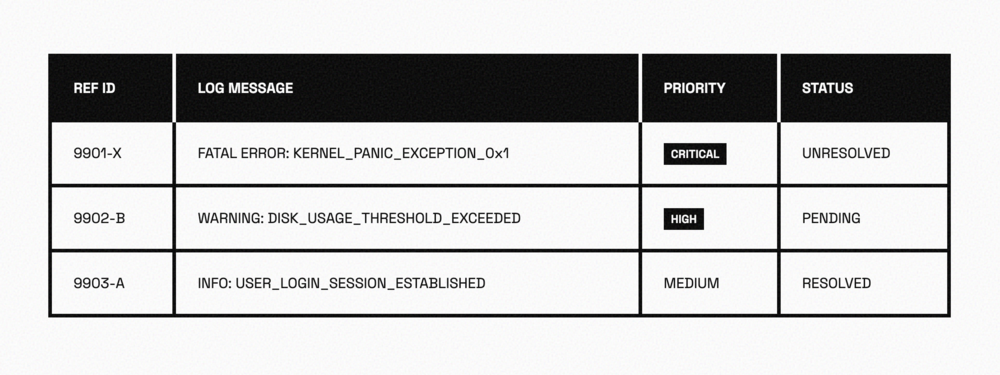
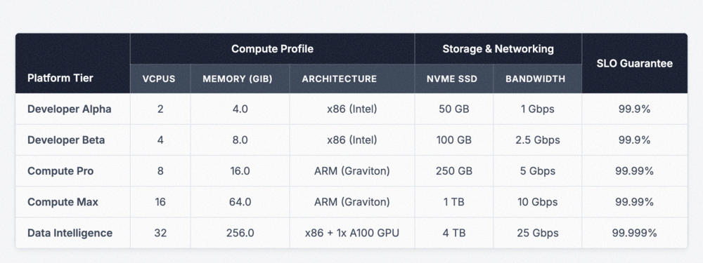
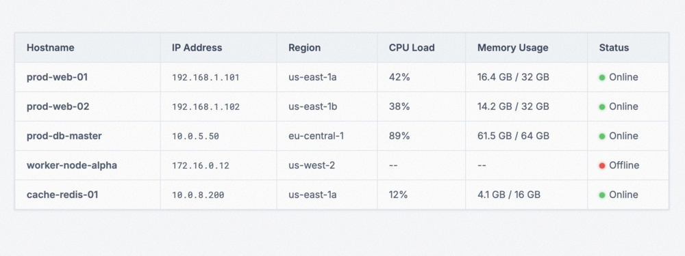
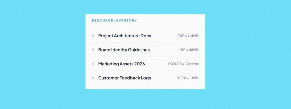
Micro Data Table
High-density technical telemetry table utilizing JetBrains Mono for maximum data legibility in sideb...
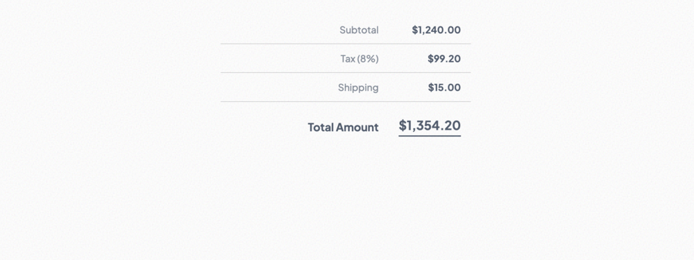
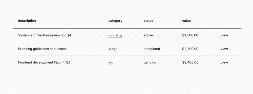
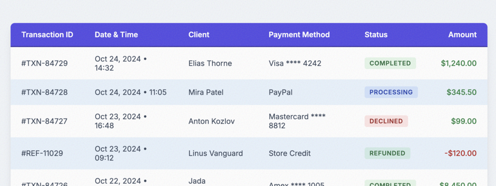
Summary Table
Right-aligned financial summary table for checkout pages and invoice breakdowns.
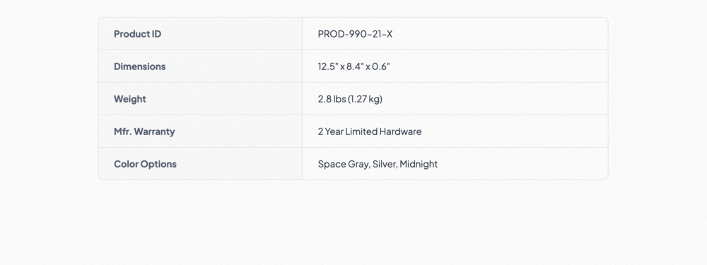
Key-Value Table
Classic label/value pair table ideal for product specifications and application settings.
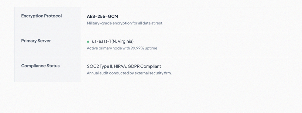
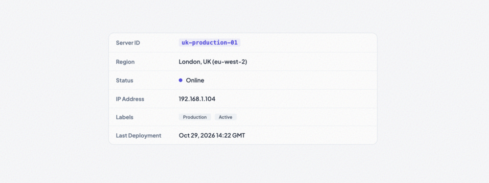
Two-Column Info Table
Rich information grid with thick vertical labels and support for descriptive multiline data points.
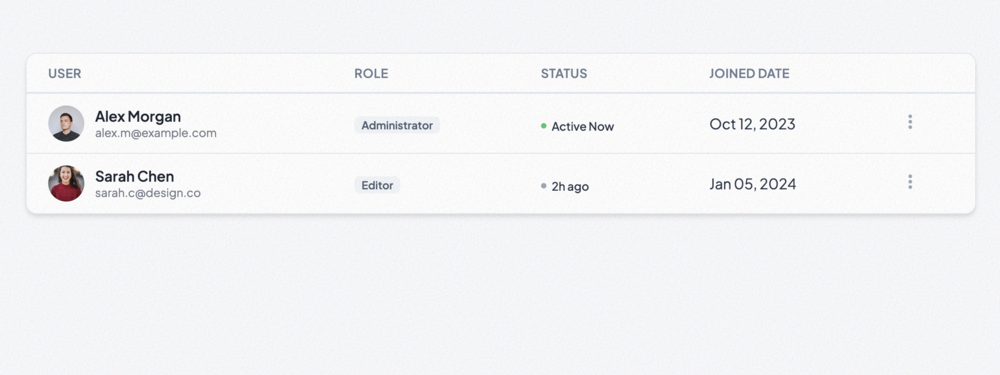
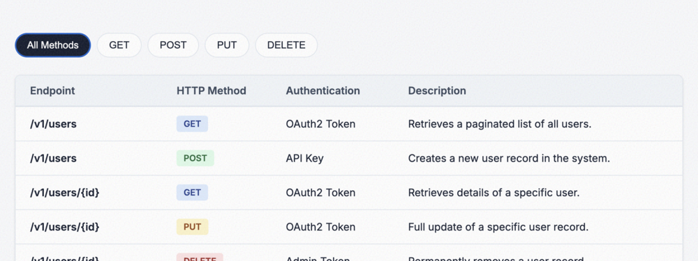
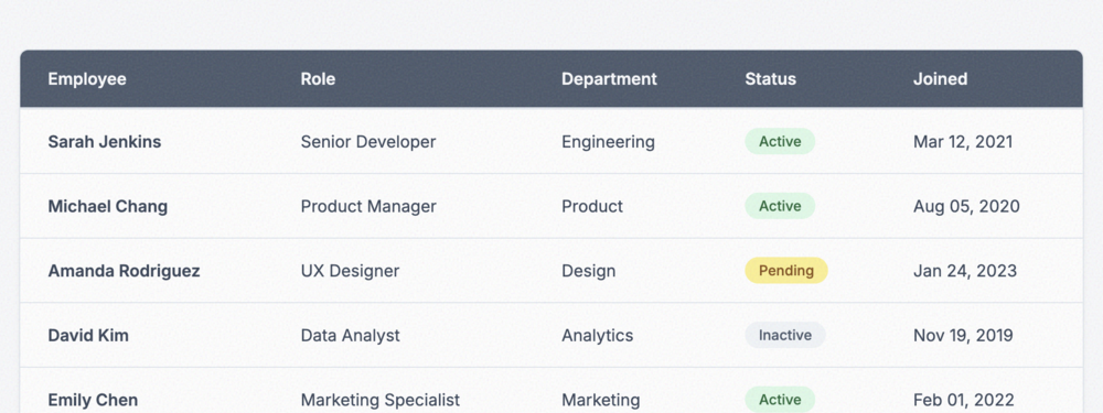
User List Table
Professional user directory featuring avatar integration, role badges, and real-time status indicato...
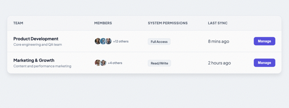
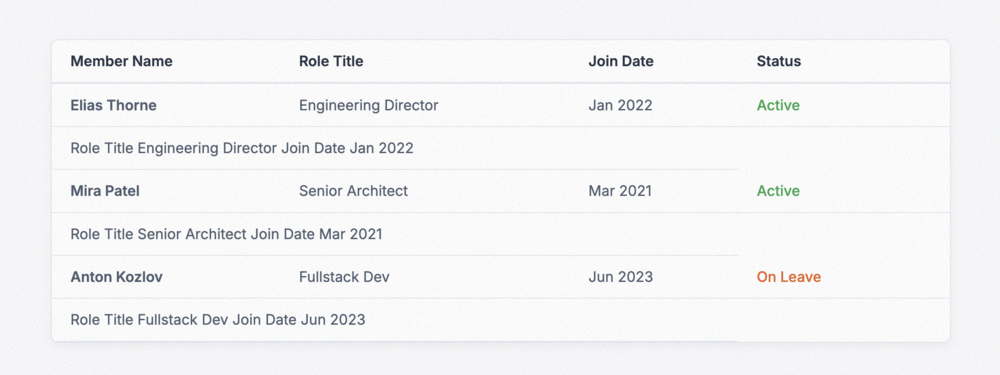
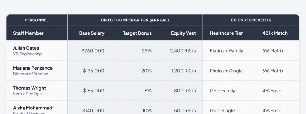
Team Management Table
Optimized for team logistics, featuring member avatar stacks, granular permission tags, and quick-ac...
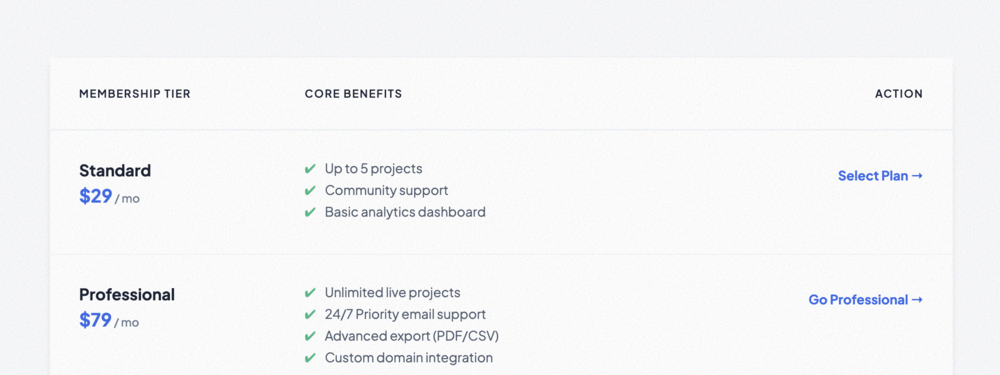
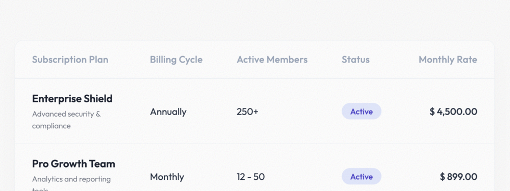
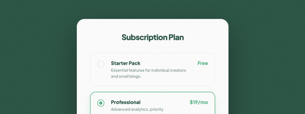
Subscription Plan Table
A feature-oriented subscription comparison table focusing on benefit checklists and clear CTA transi...
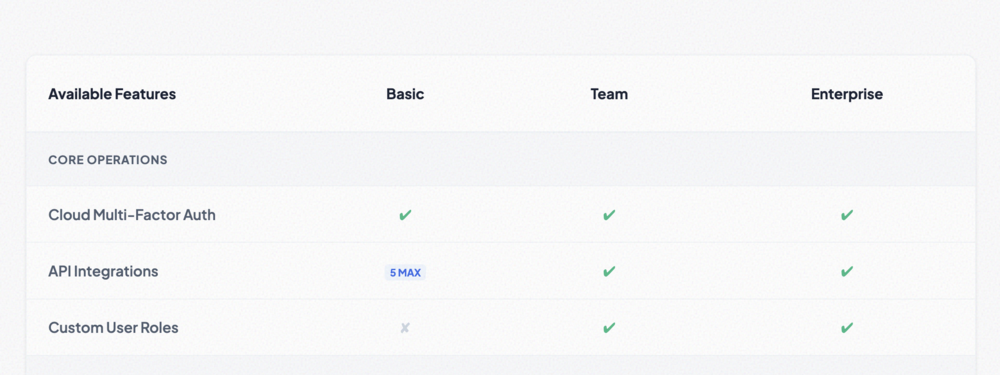
Feature Comparison Table
Deep-dive feature matrix with categorical row grouping and status icons for exhaustive product compa...
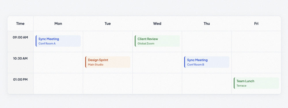
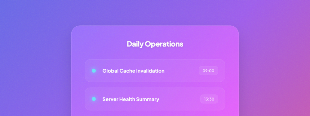
Schedule Table
A time-grid based schedule table featuring color-coded event blocks and fixed column widths for week...
Minimal Flat Table
An ultra-thin, high-end minimal table layout with lowercase headings and signature heavy bottom bord...
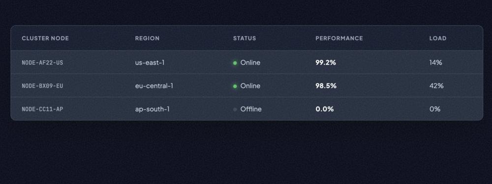
Dark Mode Table
A high-fidelity dark interface designed for data monitors, featuring neon status indicators and mono...
High Contrast Table
A striking, accessibility-first design utilizing brutalist borders and extreme contrast to ensure ma...
Glassmorphism Table
A futuristic 'frosted glass' layout that utilizes backdrop filters and semi-transparent layers for a...
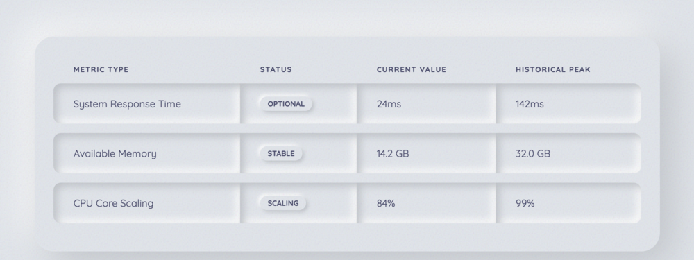
Neumorphism Table
Implements the 'soft UI' trend with realistic light and shadow physics to create a monochromatic, ex...
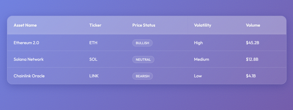
Gradient Accent Table
A modern data table featuring vibrant CSS gradients on the container borders and key data metrics fo...
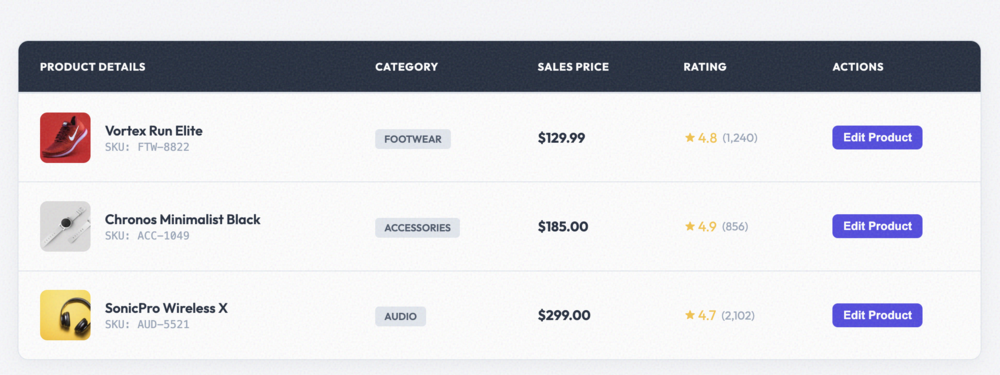
Product Listing Table
A refined product catalog table featuring image previews, star ratings, and category badges.
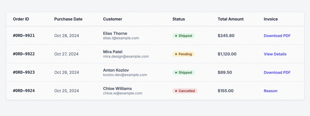
Order History Table
Detailed order tracking table with categorical status pills and integrated invoice/document links.
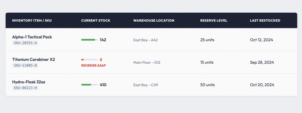
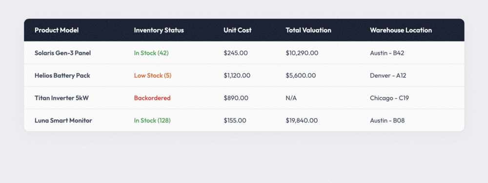
Inventory Management Table
Optimized for warehouse logistics, this table features visual stock level bars and reactive reorder ...
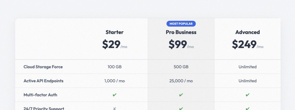
Pricing Comparison Table
A high-conversion comparison matrix with an integrated 'Recommended' column highlight and interactiv...
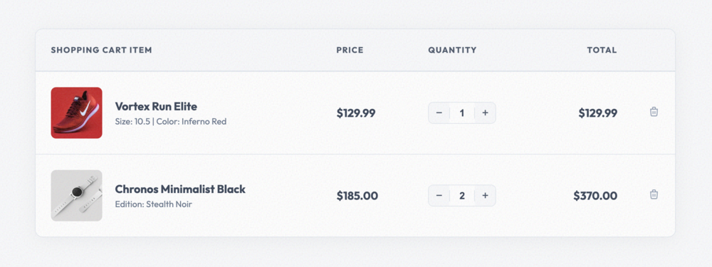
Shopping Cart Table
Modern shopping cart layout featuring high-res thumbnails, variant details, and quantity input contr...
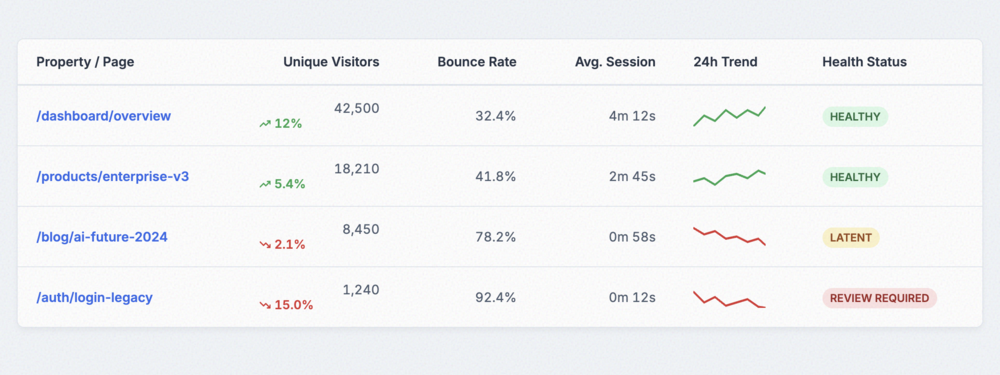
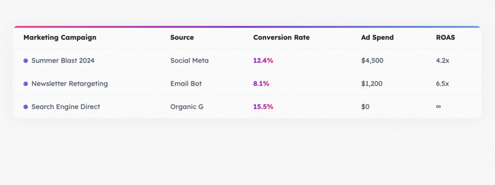
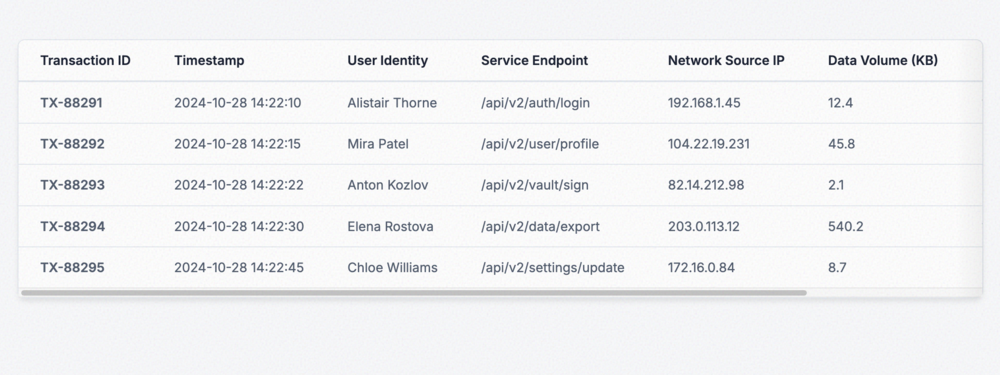
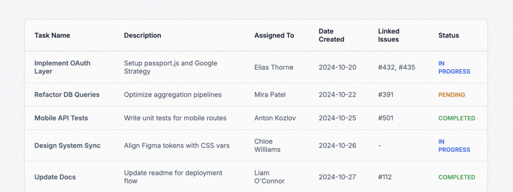
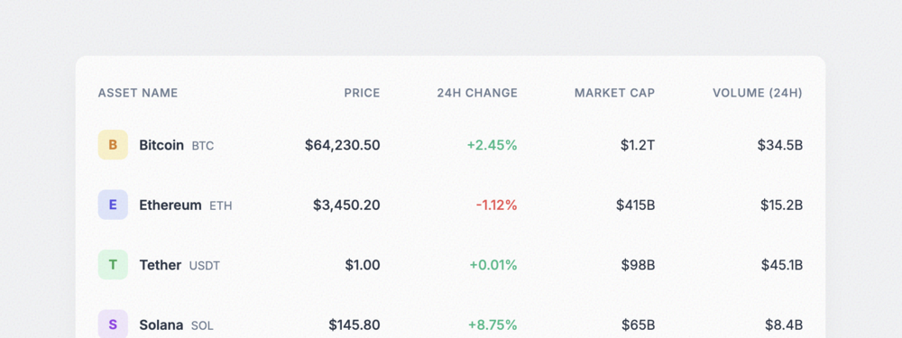
Analytics Data Table
A feature-rich analytics table featuring inline trend lines (sparklines), percentage shifts, and sta...
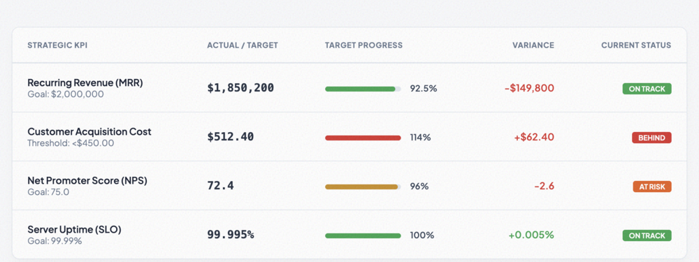
KPI Metrics Table
Designed for performance tracking, this table provides high visibility into metrics using bold progr...
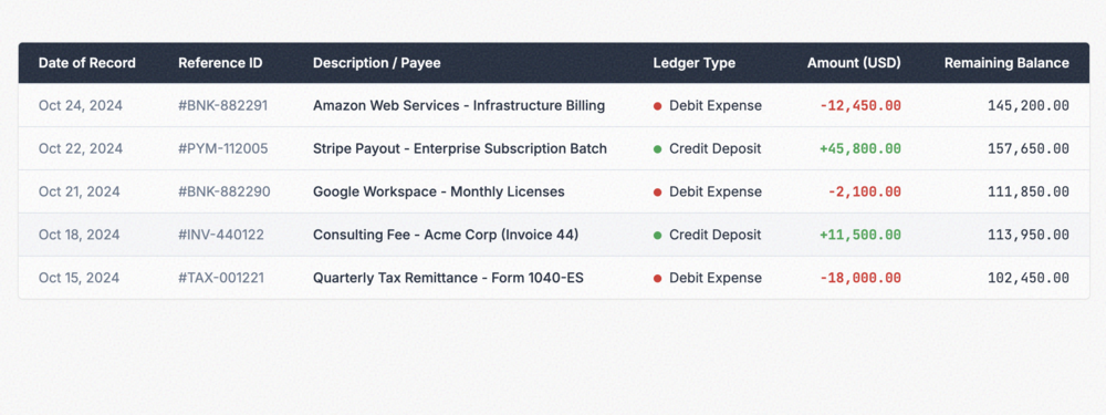
Financial Data Table
A professional ledger-style table optimized for financial data, featuring tabular monospace figures ...
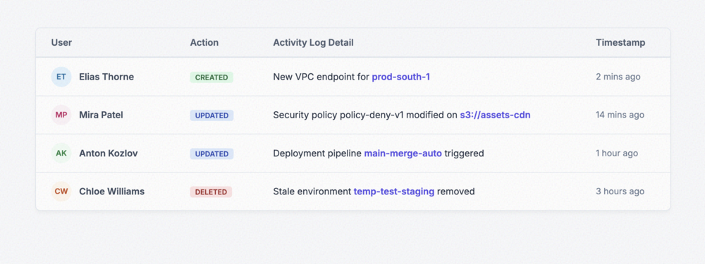
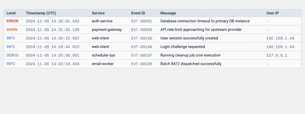
Activity Log Table
A streamlined log table that combines user avatars, categorical action badges, and relative timestam...
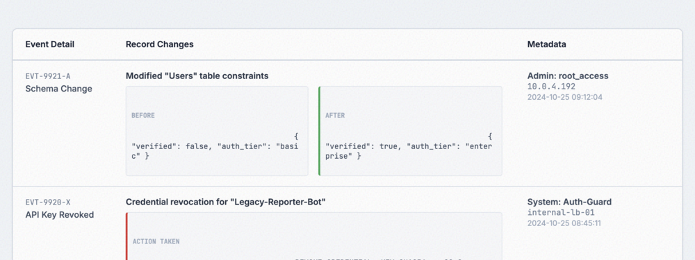
Audit Trail Table
A security-first audit table displaying dense event logs, including 'Before' and 'After' record stat...
Horizontal Scroll Table
A classic responsive solution that keeps column structures intact by allowing horizontal scrolling o...
Stacked Mobile Table
Transforms high-column tables into a vertical stack on mobile, using data-attributes to maintain lab...
Collapsible Row Table (Mobile)
Intelligently hides secondary columns on mobile and replaces them with a details toggle for a cleane...
Card-Based Responsive Table
The ultimate mobile transformation: converts table rows into sleek, independent cards with prioritiz...
Priority Column Table
An adaptive strategy that selectively drops low-priority columns as screen size decreases to maintai...
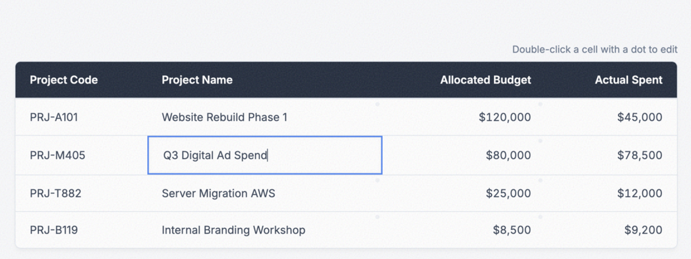
Inline Editable Table
A table with cells that can be double-clicked to edit in-place, featuring simulated save mechanics.
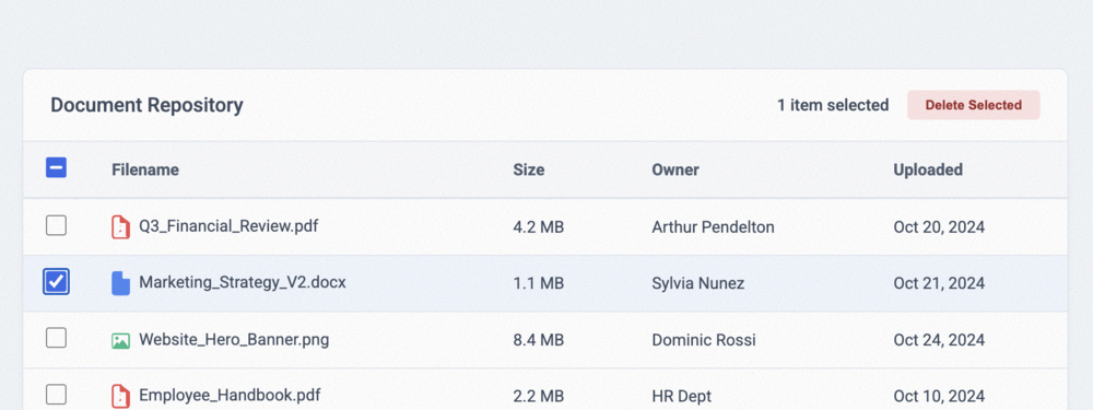
Selectable Row Table
A robust data table equipped with individual row checkboxes and a master 'Select All' toggle, comple...
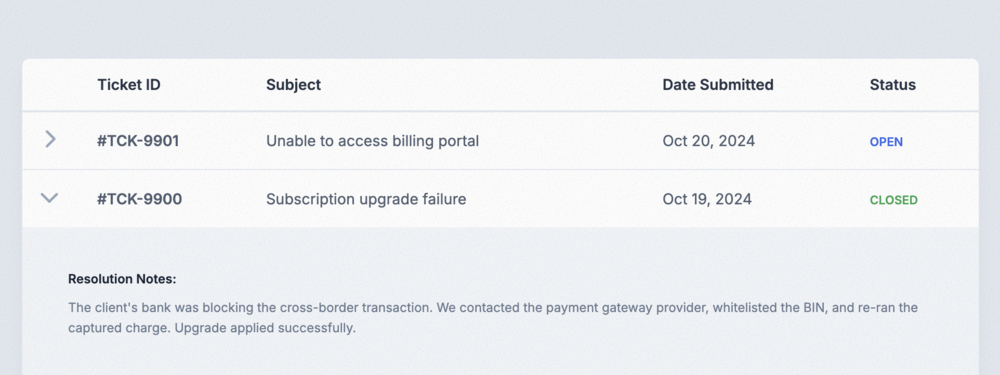
Expandable Row Table
An interactive accordion-style table where clicking a row reveals an expanded sub-panel with extende...
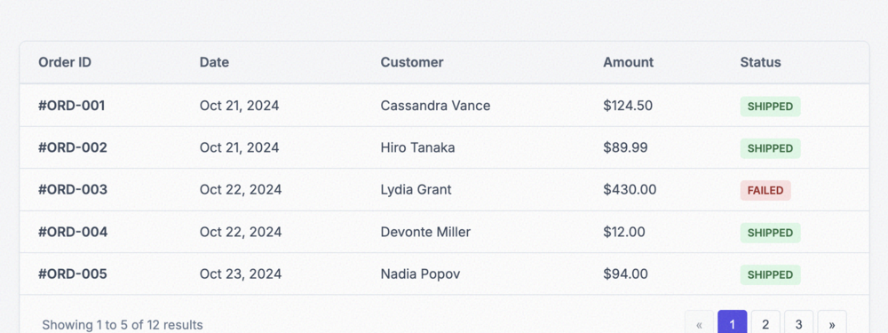
Pagination Table
A front-end paginated data table demonstrating how to chunk large datasets across numbered control p...
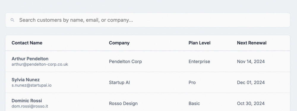
Searchable Table
A table integrated with a dynamic, real-time search input that automatically filters out non-matchin...
Filterable Data Table
An interactive data table paired with categorical selection pills to swiftly limit viewable rows to ...
Sortable Column Table
A dynamic table allowing users to click column headers to toggle ascending or descending sorting mod...
Fixed Header Table
A highly functional table confined to a specific height, allowing rows to scroll vertically while th...
Sticky Header and Footer Table
A scrollable table featuring both a fixed sticky header and a fixed sticky footer for persistent tot...
Multi-Row Header Table
A complex data table with spanning headers (colspans/rowspans) to represent hierarchical data catego...
Grouped Header Table
A table that visually groups related columns together using explicit dividers and alternating column...
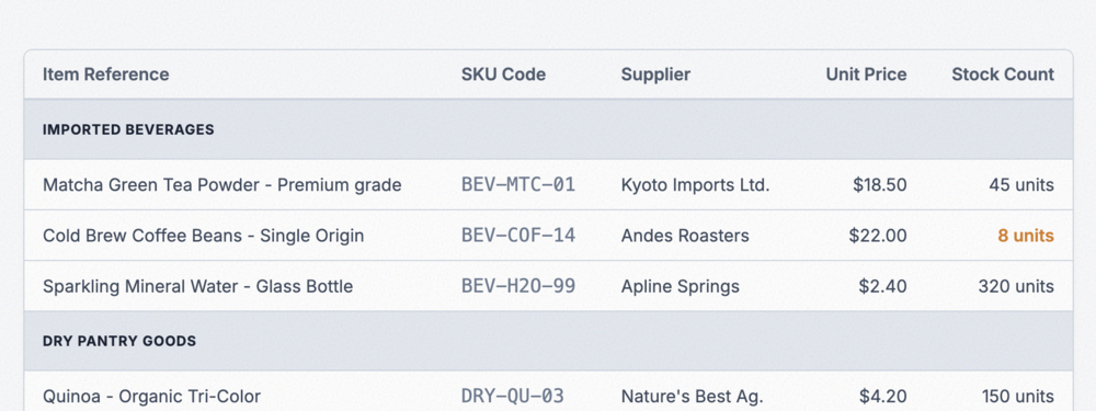
Sectioned Data Table
A table utilizing specially styled full-width rows to divide data into distinct semantic sections or...
Basic Data Table
A clean and modern basic data table with hover states and a subtle border structure.
Striped Row Table
A highly readable table using zebra-striping to guide the eye across wide rows.
Bordered Grid Table
A classic fully bordered grid layout, ideal for dense, multi-column technical data.
Borderless Minimal Table
An ultra-minimal table stripping away all borders, utilizing negative space to define the structure.
Compact Dense Table
A highly condensed table format designed for admin panels and log viewers with extensive data.
Spacious Data Table
An airy and elegant table prioritizing readability with generous padding and subtle borders.
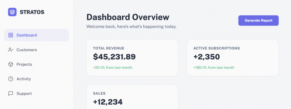
Stratos Vertical Sidebar
A professional vertical sidebar navigation designed for complex applications and dashboards. Feature...
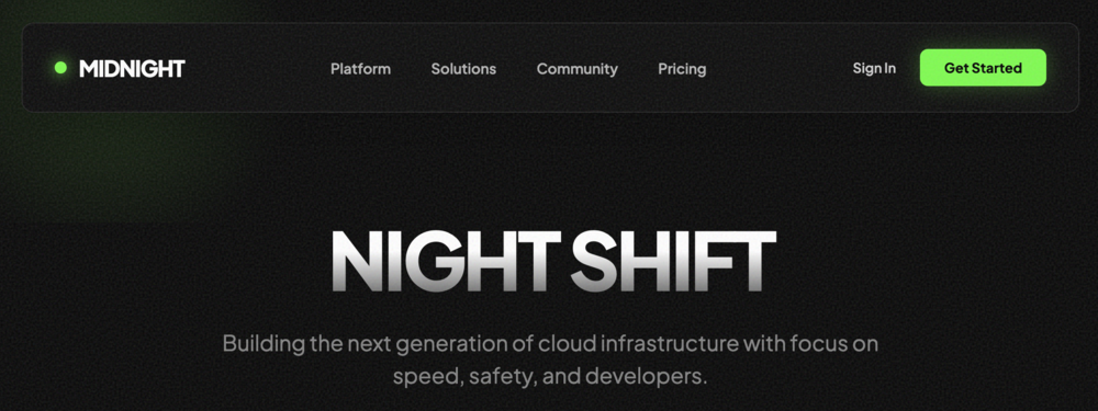
Midnight Pro Navbar (Dark Mode)
A high-end 'Dark Mode' navigation bar featuring neon accents, glassmorphic backdrop-filters on scrol...
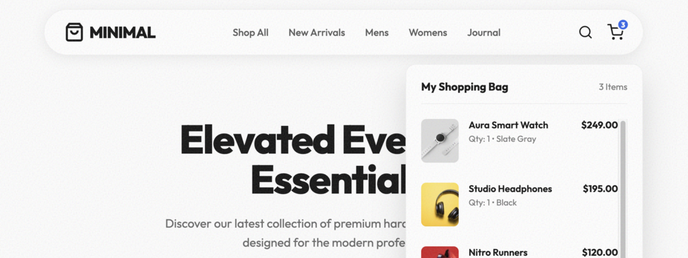
Retail Hub Navbar with Cart Preview
A high-conversion e-commerce navigation bar featuring a real-time shopping cart preview, dynamic ite...
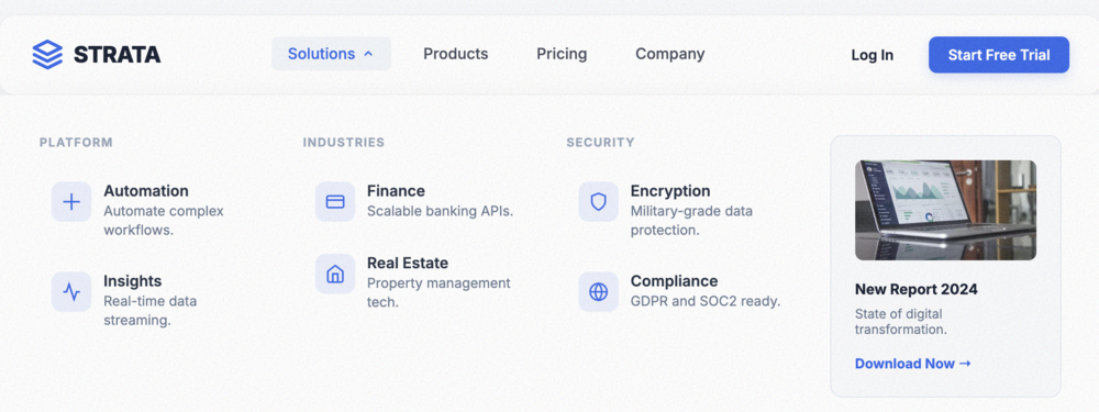
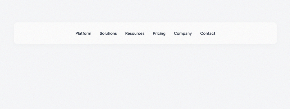
Enterprise Mega Menu
A sophisticated, multi-column mega menu designed for content-heavy sites and enterprise SaaS platfor...
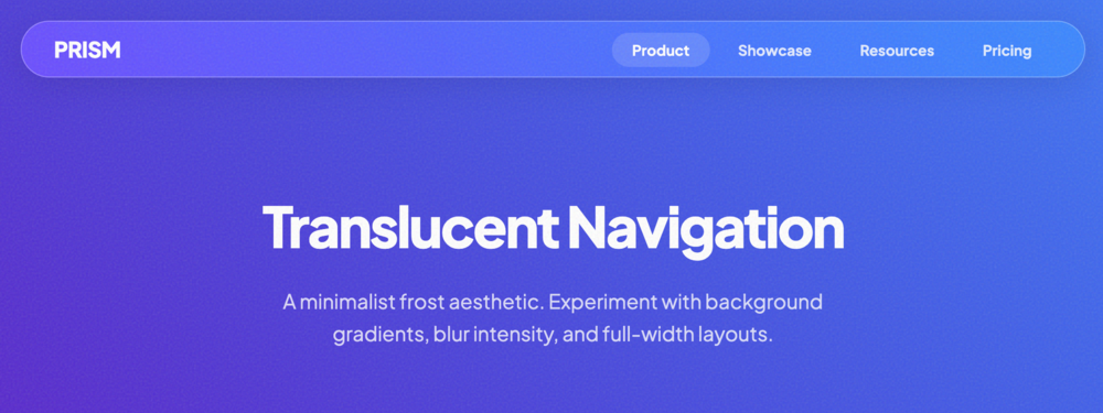
Glassmorphic Navbar
A modern, frosted-glass effect navigation bar with a luminous accent glow and responsive mobile menu...
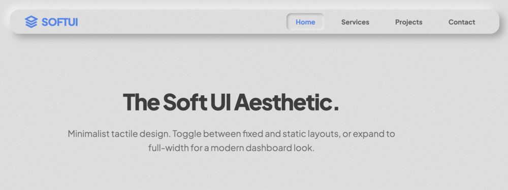
Neumorphic Navbar
A clean Neumorphic (Soft UI) navigation bar with extruded layout and smooth tactile hover states. Pe...
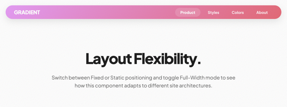
Gradient Navbar
A vibrant navigation bar featuring a custom linear gradient background, customizable rounding, and s...
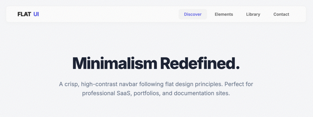
Minimal Flat Navbar
A crisp, minimalist navigation bar following flat design principles. High contrast, sharp typography...
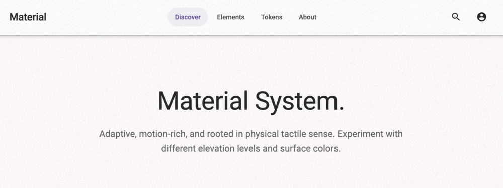
Material Design Navbar
A Google Material Design 3 inspired navigation bar. Features consistent elevation shadows, primary c...
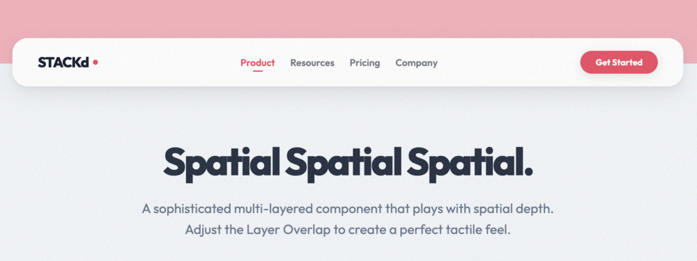
Layered Elevation Navbar
A sophisticated multi-layered navigation bar. Features a distinct top base bar with a secondary floa...
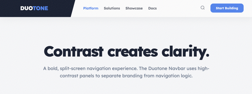
Duotone Split Navbar
A bold, two-tone navigation bar with a distinct split-screen aesthetic. Ideal for high-contrast bran...
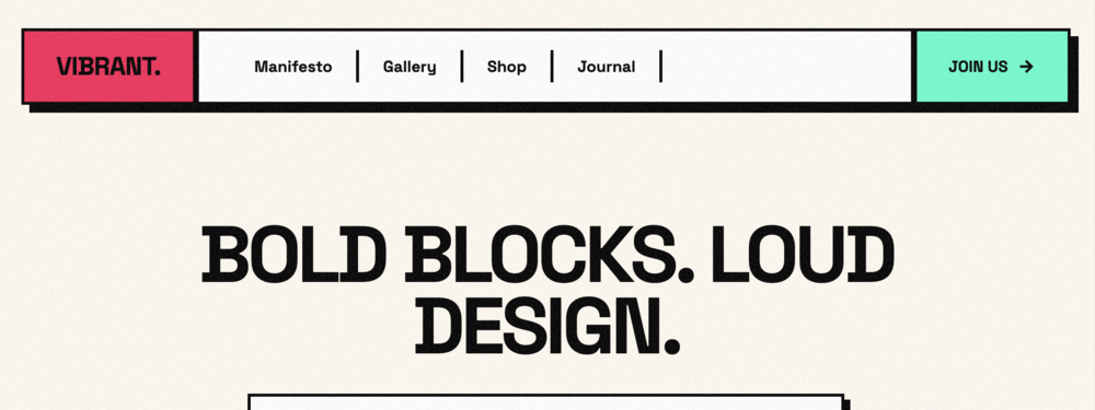
Vibrant Color Block Navbar
A high-energy, Neo-Brutalism inspired navigation bar using bold saturated blocks and thick black bor...
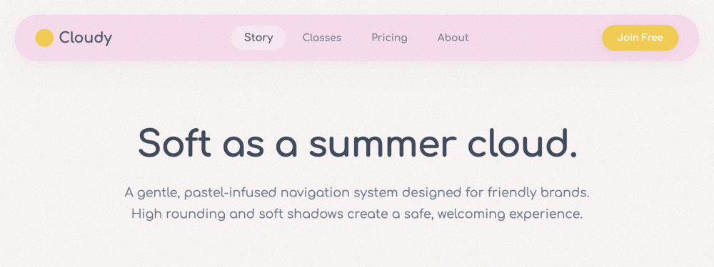
Pastel Dream Navbar
A soft, friendly navigation bar with deep rounding, pastel hues, and gentle typography. Perfect for ...
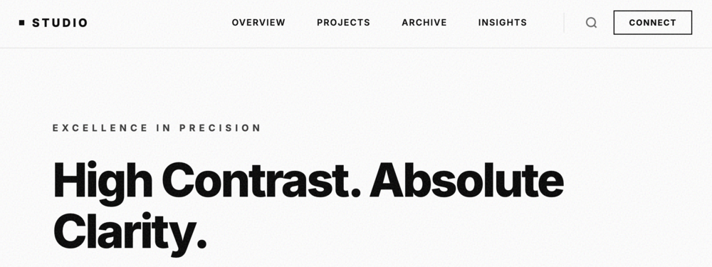
Monochrome Tech Navbar
A sharp, high-precision monochrome navigation bar. Features ultra-thin lines, inverted hover states,...
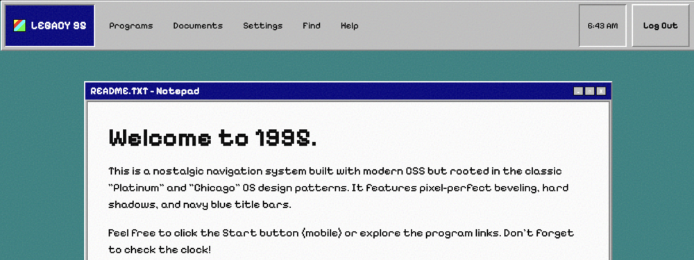
Retro UI Navbar
A nostalgic navigation bar inspired by classic 90s operating systems. Features beveled 3D borders, p...
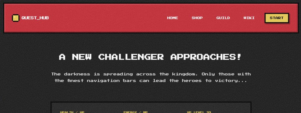
Pixel Art RPG Navbar
A charming, high-character navigation bar inspired by 8-bit RPGs. Features chunky pixel-art borders,...
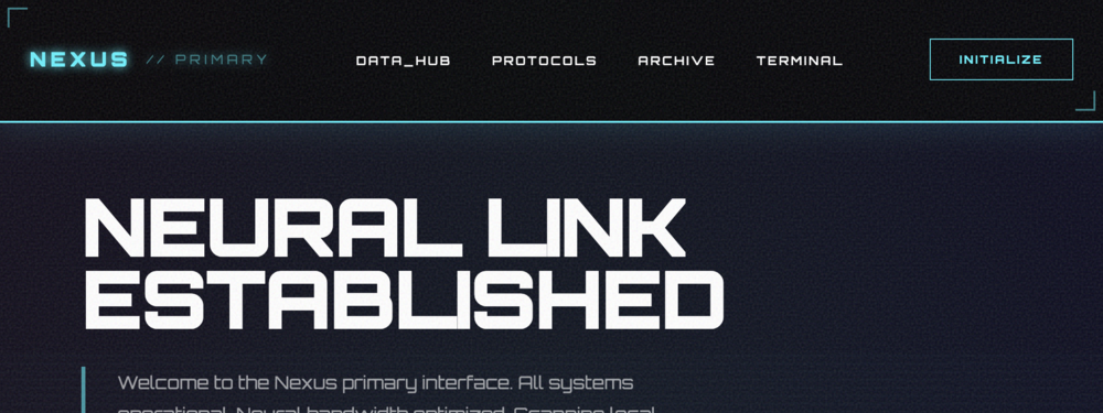
Futuristic Glow Navbar
A high-tech, futuristic navigation bar with vibrant neon glow effects, HUD-style scanlines, and flui...
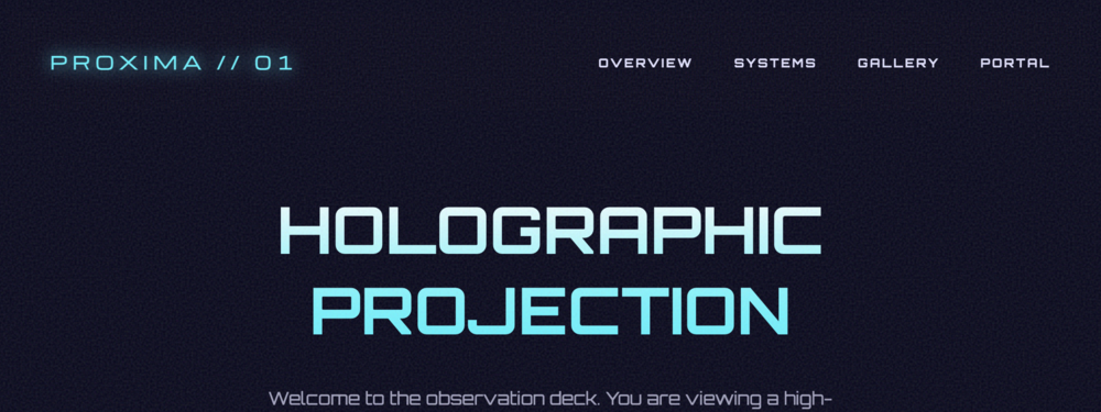
Holographic Projection Navbar
A mesmerizing holographic navigation bar featuring iridescent color shifts, luminous 'light projecti...
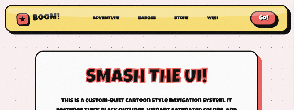
Cartoon Style Navbar
A playful, cartoon-inspired navigation bar. Features thick black 'comic book' outlines, vibrant satu...
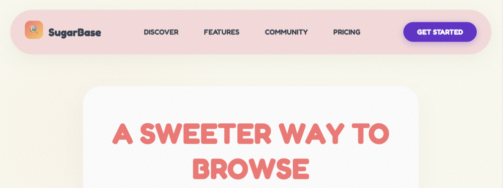
Playful Candy Navbar
A cheerful, multi-colored navigation bar featuring 'candy-coated' links. Each navigation item transf...
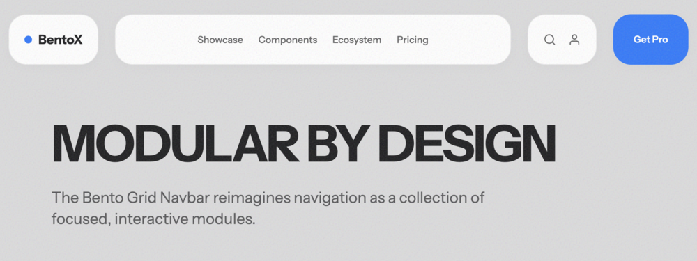
Bento Grid Navbar
A modular, bento-inspired navigation bar. Organizes the brand, navigation links, and actions into di...
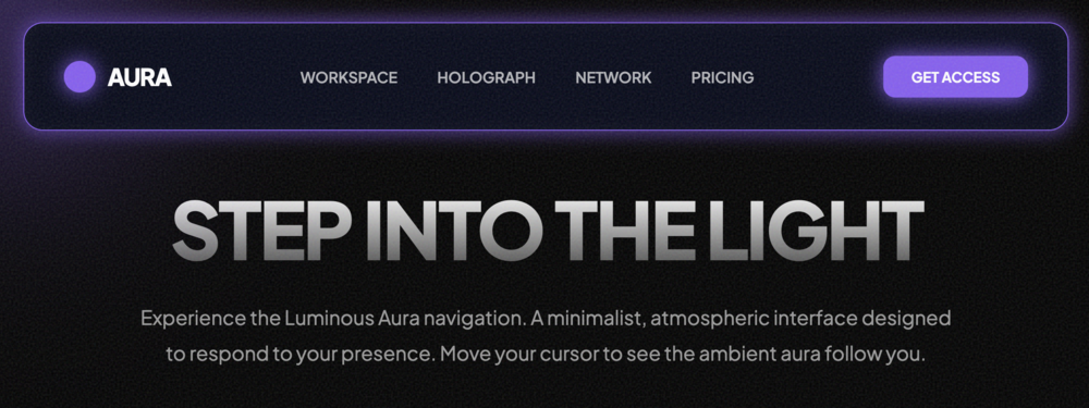
Luminous Aura Navbar
A sophisticated navigation bar featuring a dynamic 'aura' glow that follows the cursor. Built with h...
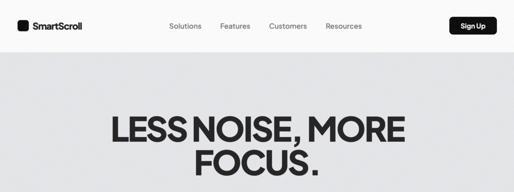
Smart Scroll Navbar
A focus-oriented navigation bar that intelligent hiding on scroll down and revealing on scroll up. D...
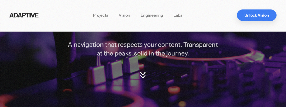
Hero Adaptive Navbar
A dynamic navbar that starts as a transparent overlay (perfect for high-impact hero sections) and se...

Stellar Primary Button
A high-impact, premium primary action button featuring smooth gradients, dynamic hover lifting, and ...

Luminous Ghost Button
A sophisticated secondary action button featuring a delicate luminous outline, glassmorphic surface ...

Stellar Text Button
A minimalist text-only button with a kinetic underline effect that grows from the center on hover. I...
Luminous Orbit Icon Button
A high-fidelity circular icon button featuring glassmorphic transparency, an animated orbital hover ...
Aura Hybrid Button
A premium hybrid button combining flexible vector iconography with high-impact typography. Supports ...
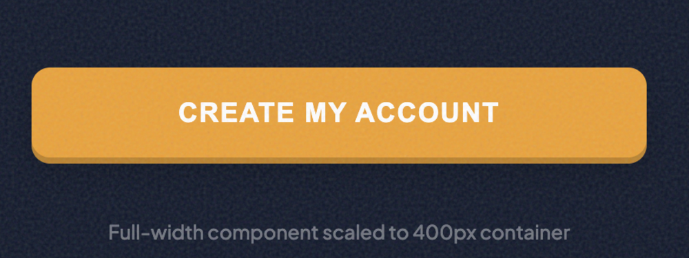
Kinetic Block Button
A powerful full-width action button designed for maximum conversion. Features a tactile 3D feel with...

Aura Micro Button
A refined, high-density micro button designed for tight interfaces and utility actions. Bold typogra...

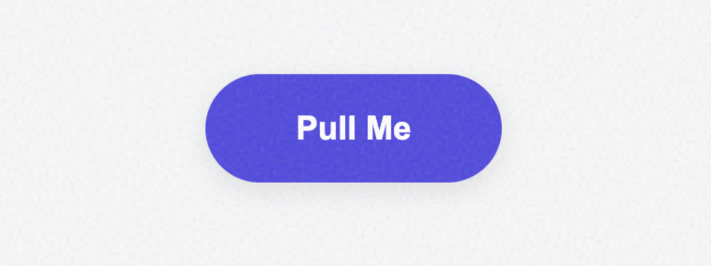
Rounded Pill Button
An elegant capsule-shaped button with a fixed pill structure. Features a luminous glow system and a ...

Cyber Sharp Button
A bold, angular button with zero rounding. Perfect for industrial, tech, or brutalist designs. Featu...

Aura Velvet Button
A friendly and modern button with soft, pleasant corners. Features a sophisticated velvet gradient, ...
Orbital Pulse Button
A striking circular icon button featuring an animated 'orbital pulse' system. Perfect for primary fl...
Aura Tectonic Button
A sharp, angular icon button with a bold tectonic feel. Features offset depth shadows and a satisfyi...

Glass Segmented Control Button
A sophisticated glassmorphic segmented control featuring a smooth sliding active state and 3 customi...

Aura Solid Button
A refined, pure solid-fill button. Features a clean architectural design with subtle inner highlight...

Aura Outline Button
A sharp, minimalist outline button with a sophisticated interactive fill transition. Features adjust...

Aura Ghost Button
A minimalist ghost button that remains subtle until interaction. Features a soft background tint, te...
Glassmorphic Transparent Button
A high-fidelity glassmorphic button with adjustable surface transparency and backdrop blur. Perfect ...

Aura Inverted Button
A high-impact, high-contrast button that swaps its foreground and background colors on hover. Featur...
Spectrum Gradient Button
A vibrant, multi-color gradient button with an animated hover state. Features a soft atmospheric glo...

Slate Monochrome Button
A sophisticated single-color button focusing on depth, texture, and architectural precision. Feature...

Aura Duotone Button
A high-contrast duotone button featuring kinetic horizontal motion and a satisfying offset block sha...
Zenith High-Contrast Button
A high-visibility, neo-brutalist button designed for accessibility and maximum impact. Features heav...

Soft Sorbet Pastel Button
A soft and airy pastel button with a cloudy aesthetic. Features multi-layered desaturated shadows an...
Aura Neon Pulse Button
A high-energy futuristic button featuring customizable neon glows and interactive lighting effects. ...

Aura Fade Hover Button
A sophisticated interaction button focusing on ultra-smooth color transitions. Ideal for professiona...

Aura Slide Hover Button
A satisfying kinetic interaction button where a solid background slides into focus on hover. Perfect...

Aura Expand Button
A high-fidelity tactile interaction button that expands with a satisfying bounce on hover. Features ...

Aura Underline Reveal Button
A refined minimalist link-style button featuring a kinetic directional underline reveal. Perfect for...

Aura Border Trace Button
A sophisticated interaction button featuring an SVG path that 'traces' the button's perimeter on hov...

Aura Ripple Click Button
A high-fidelity interaction button featuring a Material Design-inspired ripple effect. Spawns an exp...

Loading Spinner Button
A professional loading state button featuring a smooth spinner animation and layout transition. Perf...
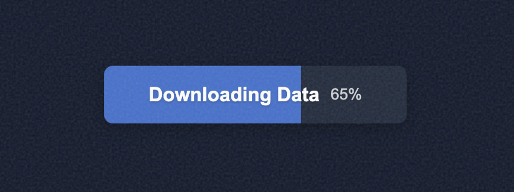
Progress Indicator Button
A high-visibility progress button that fills dynamically based on a percentage value. Includes a sub...

Pulse Animation Button
A high-conversion button featuring a continuous rhythmic pulse animation. Perfect for Call-to-Action...
Bounce Click Button
A playful, tactile button that features a realistic 3D 'squish' effect on click. Uses spring-based C...

Bioluminescent Glow Button
A sophisticated button featuring a 'bioluminescent' breathing glow effect. The aura subtly expands a...

Elastic Morphing Button
A dynamic button that morphs its physical shape and color on hover. Uses a complex cubic-bezier tran...

Minimal Flat Button
A clean, distraction-free flat button designed for secondary actions. No shadows or borders, focusin...
High-Elevation Raised Button
A premium elevated button featuring complex multi-layered shadows to simulate realistic depth and ph...
Airy Soft-Shadow Button
A high-end 'airy' button featuring an extremely diffused soft shadow. Perfect for minimalist designs...

Concave Pressed Button
A sophisticated interactive button that uses multiple inset shadows to create a 'pressed' or concave...

Material Floating Action Button (FAB)
A classic Material Design-inspired circular button that floats above the content. Includes a dynamic...
Glassmorphic Action Button
A sophisticated glassmorphic button that uses backdrop-filter for a realistic frosted glass effect. ...

Soft UI Neumorphic Button
A classic Neumorphic (Soft UI) button that blends seamlessly into its background. Features dual shad...
Elegant Minimalist Button
An elegant, typography-focused button. Avoids backgrounds and borders in favor of crisp Inter font a...
Neo-Brutalist Block Button
A high-impact Neo-Brutalist button featuring hard black shadows, thick borders, and vibrant colors. ...

Material 3 Tonal Button
A standard Google Material Design 3 (M3) tonal button. Features a wide corner radius, subtle elevati...
High-Impact CTA Button
A high-conversion CTA button designed for landing pages. Includes a dynamic gradient, ambient glow, ...
Interactive Submit Button
A functional submit button that transforms into a success state upon interaction. Features a vertica...
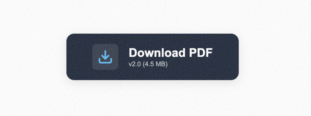
Download Button with Metadata
A specialized button for file downloads. Includes a dedicated icon area with a 'bounce' animation on...
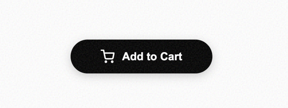
E-commerce Cart Button
A high-conversion shop button. Features an expressive cart icon that scale-rotates on hover and prov...
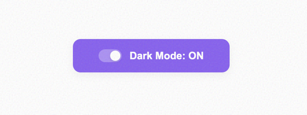
State Toggle Button
A dual-state functional button that behaves like a large switch. Perfect for settings or preferences...

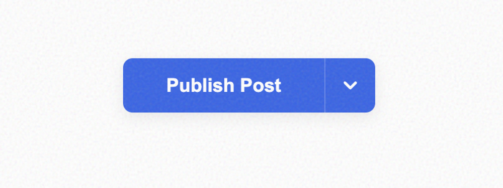
Dropdown Trigger
A standard UI trigger for dropdown menus. Includes a chevron icon that smoothly rotates when the sta...

Muted Disabled Button
A correctly styled disabled button. Focuses on low contrast, non-interactive states, and optional fu...
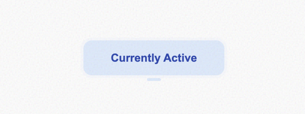
Persistent Active Button
Represents a selected or primary active state. Features a bold highlight ring and a pill-shaped indi...

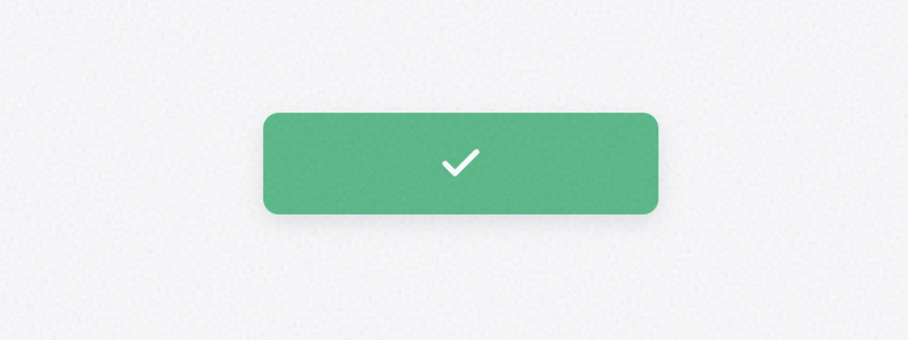
Positive Success Button
A vibrant green button for confirming successful actions. Includes an animated checkmark that draws ...
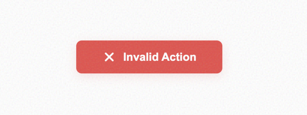
Critical Error Button
A high-visibility red button for dangerous or failed actions. Features an optional haptic shake anim...
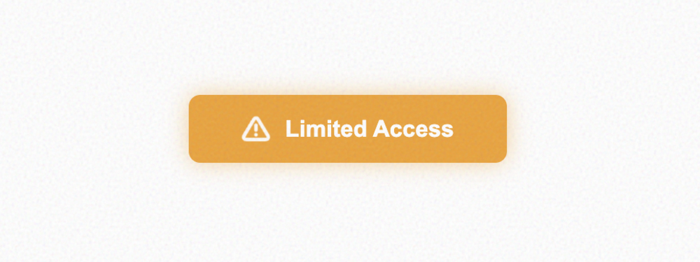
Cautionary Warning Button
An amber/orange button designed for cautionary feedback. Includes a subtle ambient glow and a pulsin...
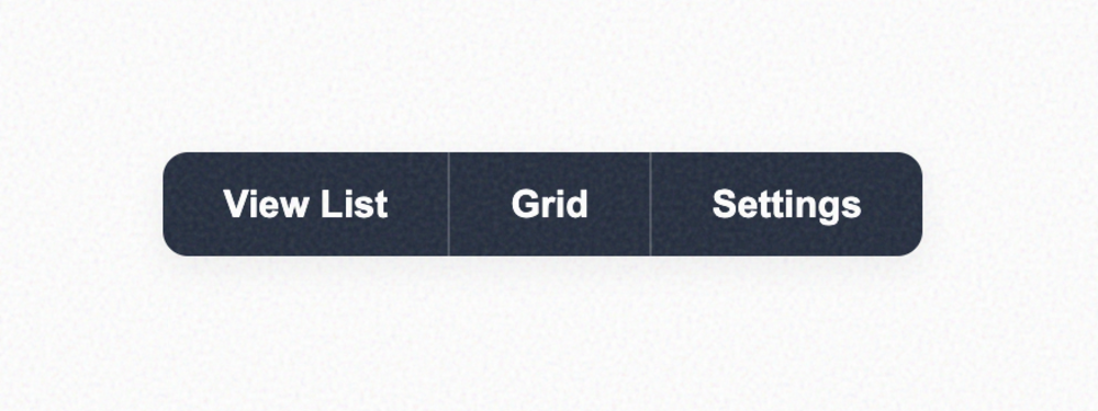
Horizontal Button Group
A set of buttons joined together horizontally. Perfect for toolbars or filtering options. The group ...
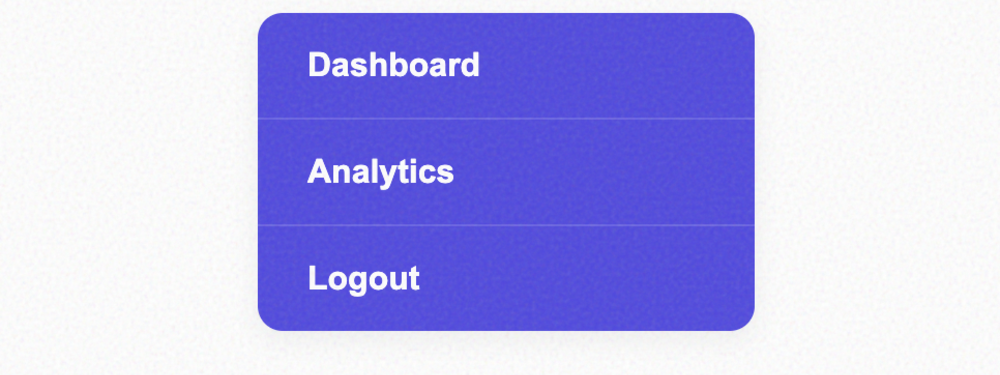
Vertical Button Group
A vertically stacked group of buttons. Ideal for navigation menus or command lists. Includes a subtl...
Dual-Action Split Button
A compound button that separates a primary action from a secondary dropdown menu. Features independe...
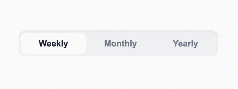
Segmented Control Group Button
A sophisticated segmented control group. One item remains highlighted at all times, making it ideal ...

Liquid Fill Effect Button
A stunning visual effect where the button appears to fill with liquid waves on hover. Features high-...
Magnetic Pull Button
An interactive button that is physically 'pulled' toward the user's cursor within a magnetic zone. C...
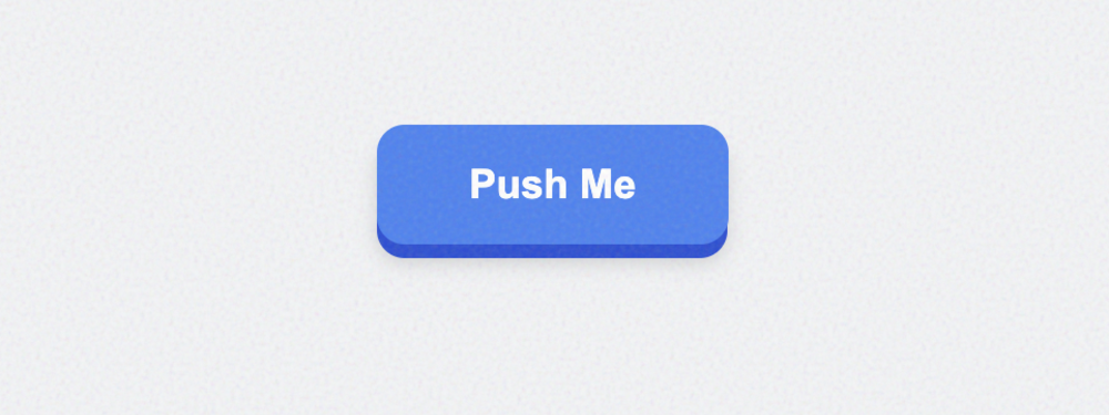
Pushable 3D Button
A retro-inspired 3D button that physically compresses when 'clicked'. Features separate face and sid...

3D Parallax Tilt Button
An immersive card-like button that tilts in 3D space in response to mouse movement. Includes a dynam...

Cyberpunk Glitch Button
Inspired by cyberpunk aesthetics, this button features rapid-slice animations and RGB displacement o...
Retro 8-Bit Pixel Button
A pixel-perfect button that uses custom box-shadow stacks to create a stepped, retro border. Comes p...
Sketch Hand-Drawn Button
An irregular, organic button that mimics the look of a marker sketch on paper. Features asymmetrical...
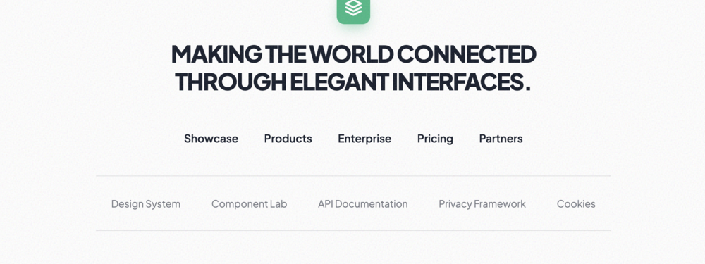
Minimalist Single Column Footer
A clean, centered single-column footer perfect for minimalist portfolios and landing pages. Features...
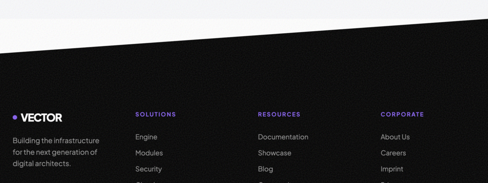
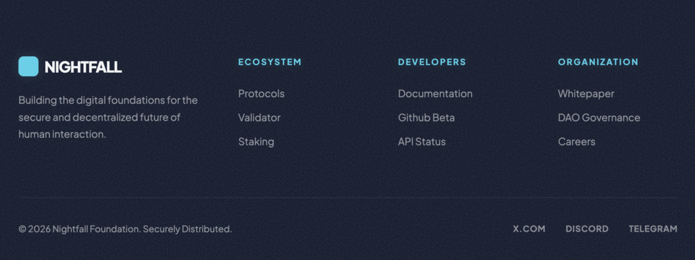
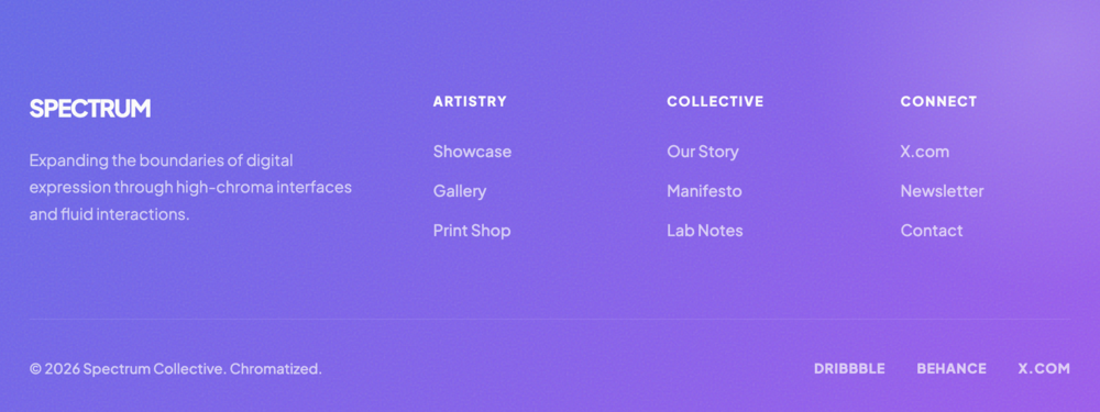
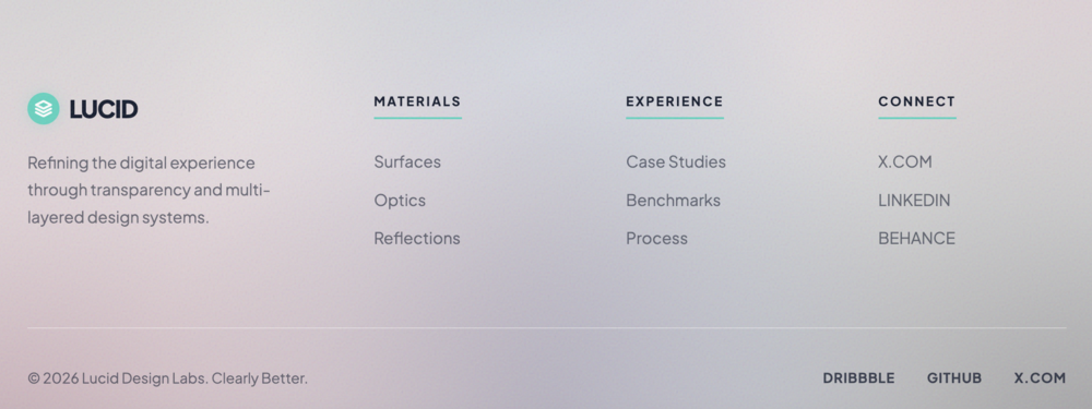
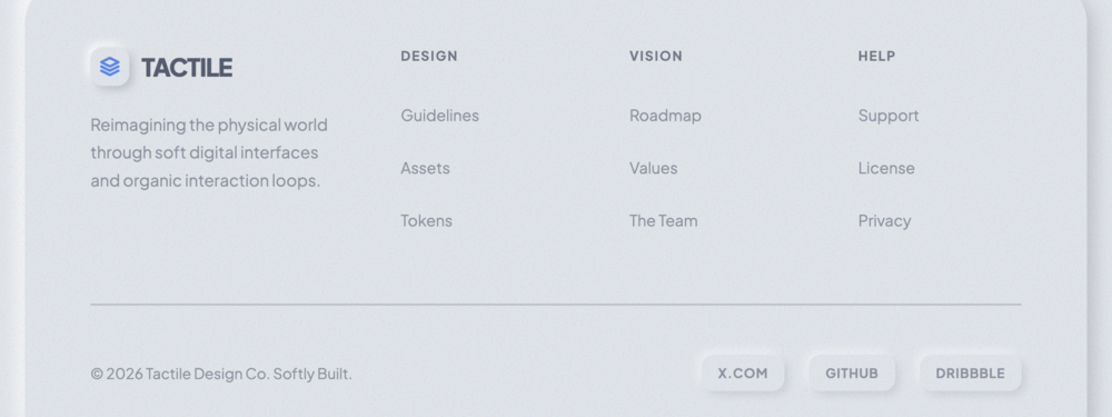
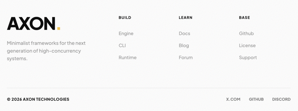
Detailed Brand & Links Footer
A sophisticated layout that provides a strong brand presence on the left and a dense grid of navigat...
Minimalist Two Column Footer
A classic, simple two-column layout with a brand tagline on the left and a unified list of links or ...
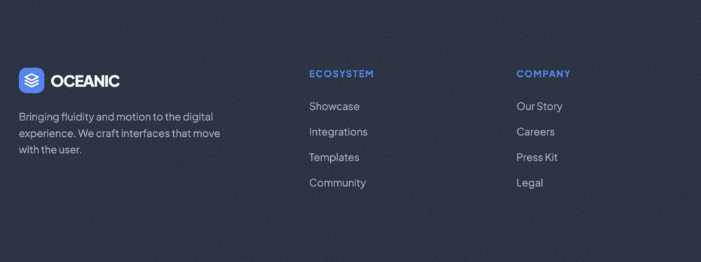
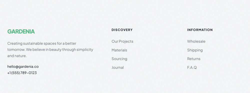
Professional Three Column Footer
A well-balanced three-column footer that offers ample space for brand storytelling, navigation, and ...
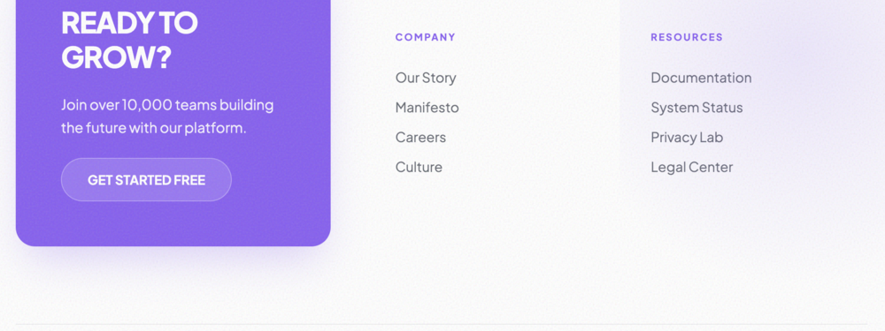
Corporate Four Column Footer
A classic, structured four-column footer that organizes large amounts of site links efficiently for ...
Extended Multi-Column Mega Footer
A comprehensive mega footer designed for large-scale websites with complex hierarchies. Provides cle...

Impactful Split Layout Footer
A bold, split-screen footer design that uses heavy typography on one side and organized navigation o...
Creative Asymmetrical Footer
A dynamic asymmetrical layout that breaks traditional grid expectations. Features a prominent, color...
Comprehensive Centered Footer
A fully centered, symmetrical footer that stacks brand identity, multi-tier navigation, and social p...
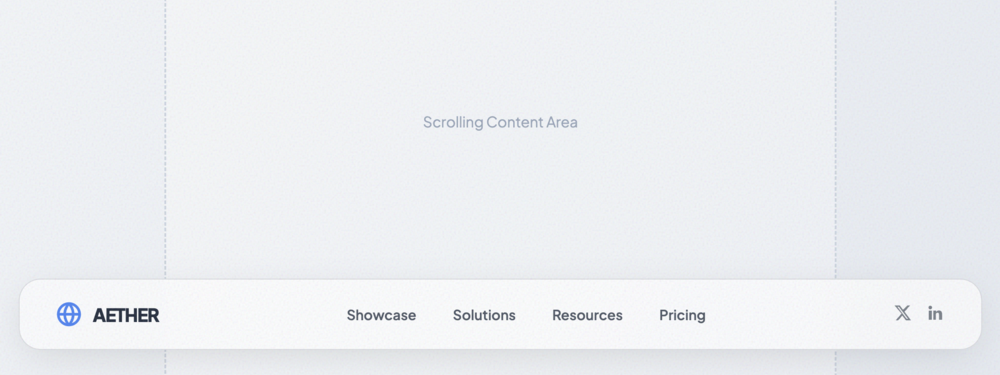
Glassmorphic Floating Footer Bar
A high-end floating footer bar with glassmorphic effects. It detaches from the bottom of the page to...
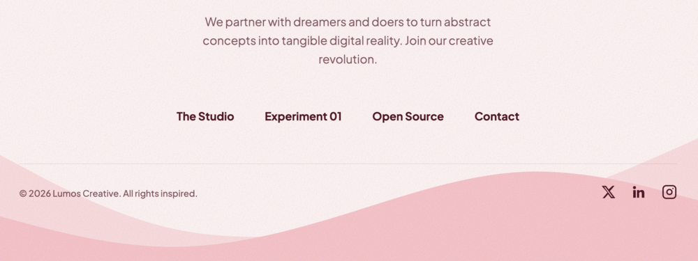
Organic Wave Footer
A stylish footer featuring a smooth, organic SVG wave transition. Perfect for adding a soft, modern ...
Angular Diagonal Footer
A sharp, modern footer with an angular diagonal transition. Perfect for high-energy brands and tech-...
Soft Curved Edge Footer
A friendly footer with a soft inward curved top edge. Ideal for consumer apps, lifestyle blogs, and ...
Creative Illustration Footer
A playful, high-character footer featuring a large abstract SVG illustration. Perfect for personal b...
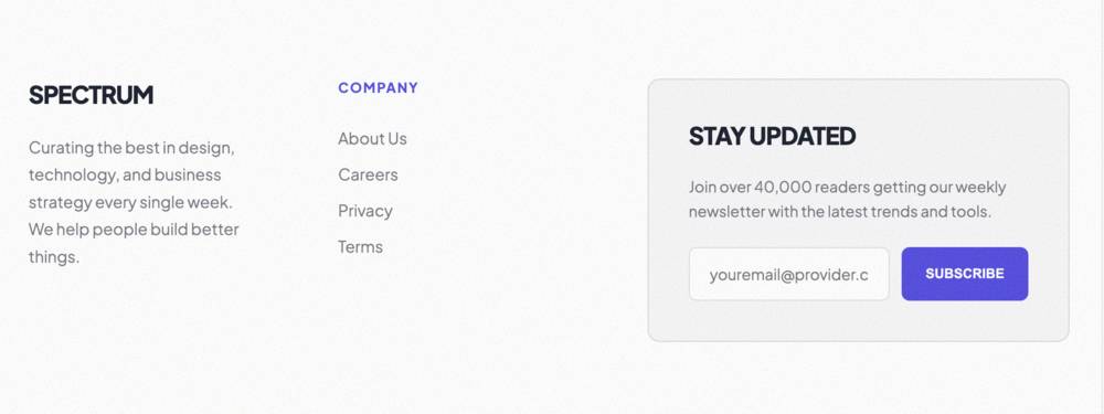
High-Conversion Newsletter Footer
A conversion-focused footer with a prominent newsletter signup form, brand storytelling, and high-im...
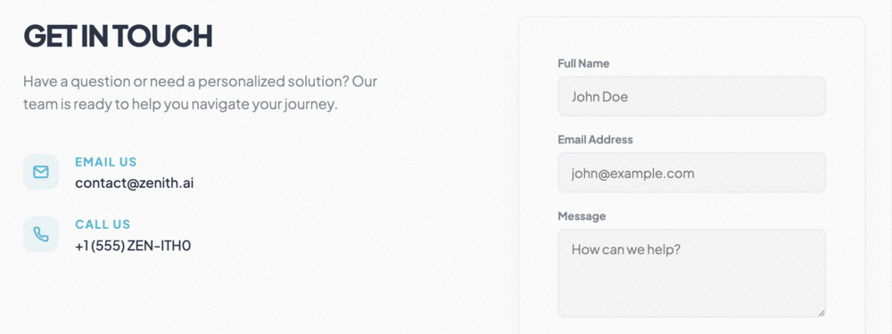
Professional Contact Footer
A contact-heavy footer that prioritizes direct communication. Features an integrated contact form an...
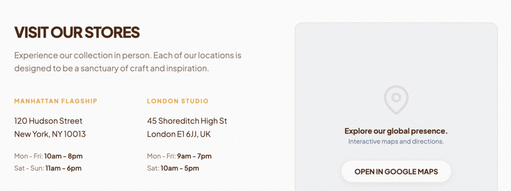
Local Focus & Map Footer
A location-centric footer featuring a large integrated map placeholder and detailed business hours. ...
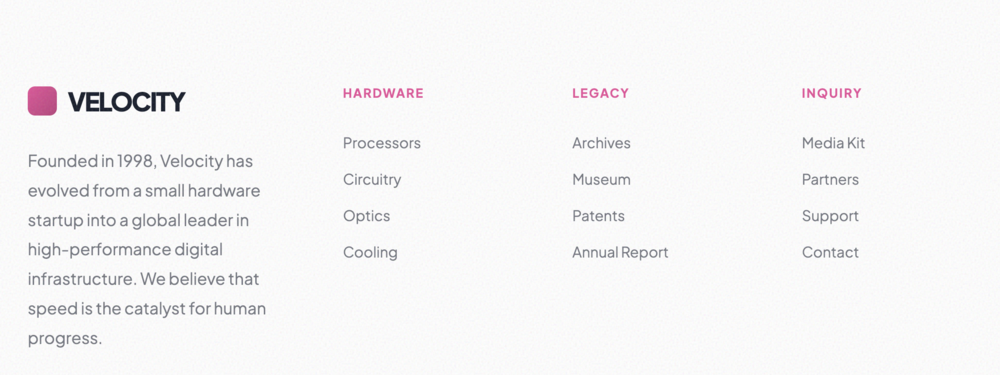
Brand Story & Links Footer
A comprehensive footer that blends deep brand storytelling with extensive site navigation. Perfect f...
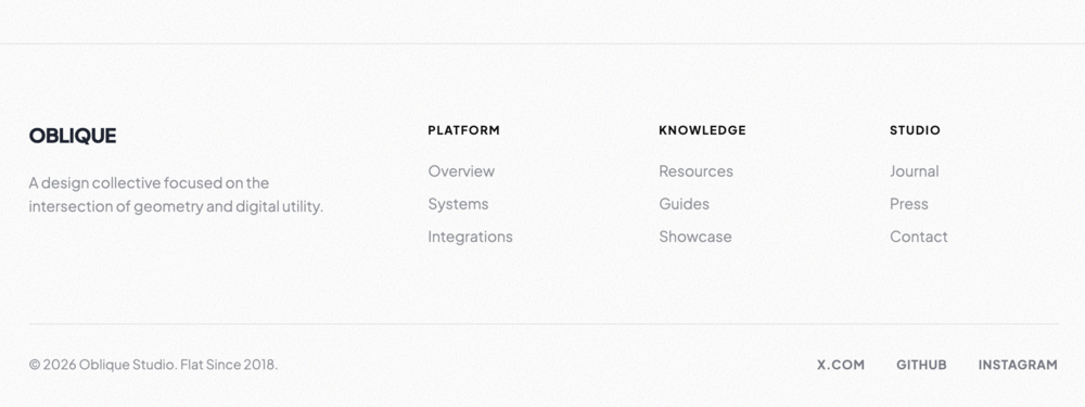
Minimalist Flat Footer
An ultra-minimalist footer with a flat design aesthetic. Prioritizes clear typography and generous w...
Premium Dark Mode Footer
A sleek, high-contrast footer optimized for dark themes. Uses subtle border treatments and vibrant a...
Dynamic Gradient Footer
A high-impact footer with a vibrant, customizable gradient background. Perfect for creative agencies...
Frosted Glass Footer
A sophisticated full-width footer with a frosted glass aesthetic. Features background blur, subtle r...
Soft UI Neumorphic Footer
A tactile, soft UI footer inspired by neumorphism. Uses dual-shadow techniques to create a physical,...
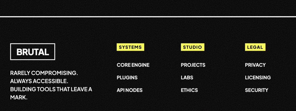
Bold High-Contrast Footer
A striking, high-contrast footer inspired by brutalist and accessible design principles. Uses bold l...
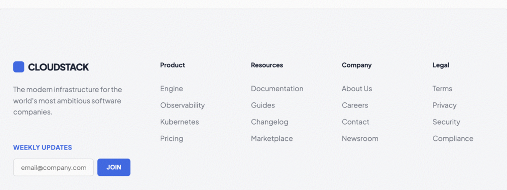
Enterprise SaaS Footer
A comprehensive, data-rich footer perfect for enterprise SaaS platforms. Features extensive link org...
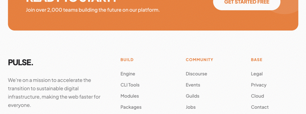
Hyper-Growth Startup Footer
A high-energy footer designed for fast-growing startups. Features a prominent call-to-action area, b...
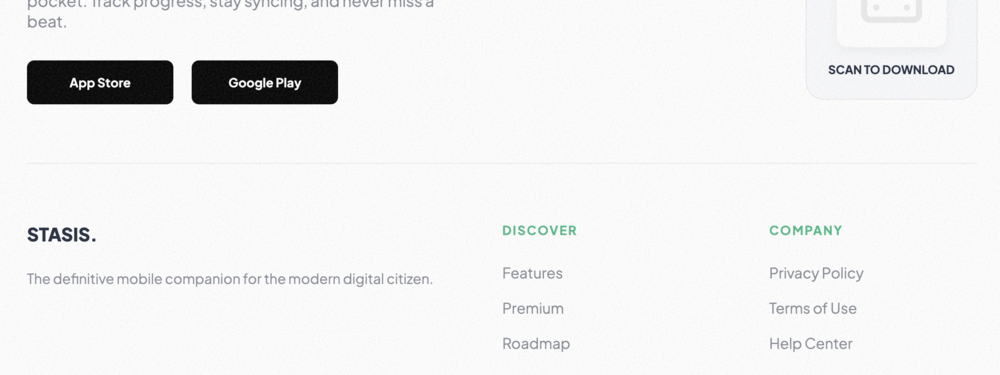
Mobile App Store Footer
A mobile-first footer designed for app marketing pages. Prioritizes app store download links and mob...
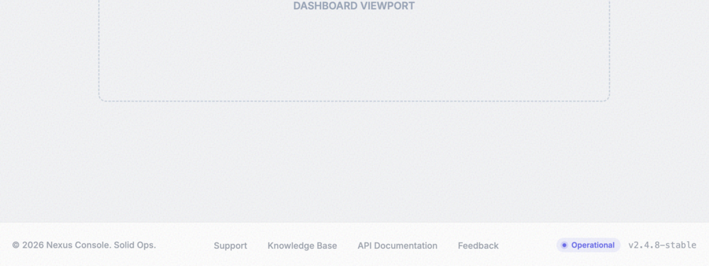
Admin Dashboard Footer
A compact, utility-focused footer ideal for internal dashboards and SaaS admin panels. Features stat...
Minimalist Tech Footer
A striking, minimalist footer tailored for clean technology and modern design platforms. Features hi...
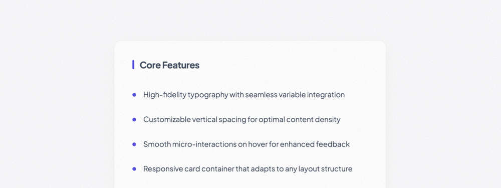
Basic Unordered List
A refined, professional unordered list featuring custom bullet interaction and optional visual divid...
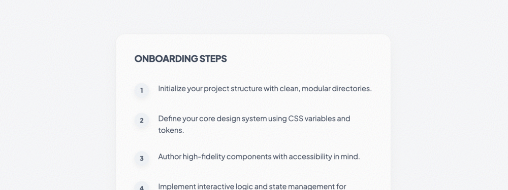
Ordered Numbered List
A professional numbered list featuring custom circular counters with advanced hover transformations.
Inline Horizontal List
A flexible horizontal list perfect for secondary navigation, footer links, or horizontally grouped l...
Divider-Separated List
A sophisticated vertical list with clean typographic hierarchy, descriptive subtexts, and customizab...

Bulletless Minimal List
An ultra-minimalist list that relies solely on whitespace and typography for structure. Perfect for ...
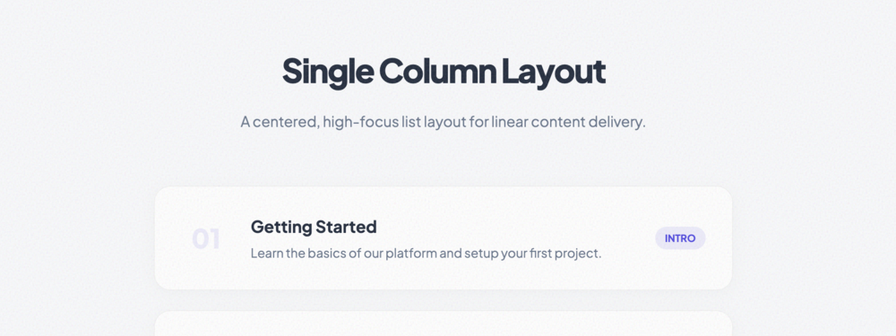
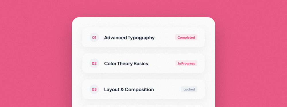
Single Column List
A high-focus single column layout balanced for linear content like tutorials, course modules, or pro...
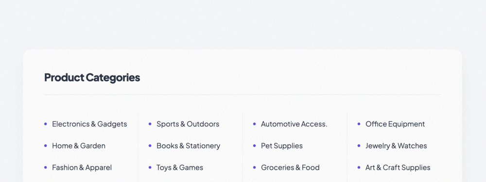
Multi-Column List
Uses CSS columns to automatically balance large lists across multiple vertical tracks. Perfect for s...
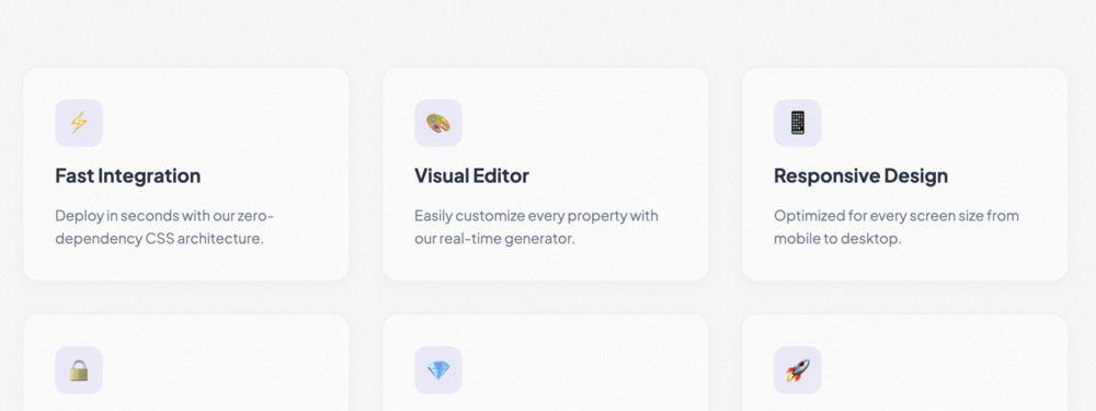
Grid-Based List
A responsive grid of feature-style cards. Each item includes an icon, title, and description area.
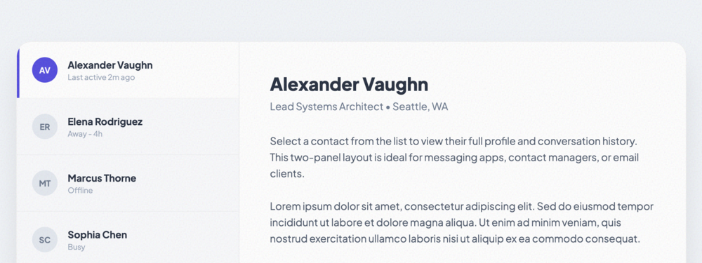
Two-Panel List Layout
A Master-Detail layout inspired by modern messaging and email apps. Features a scrollable list panel...
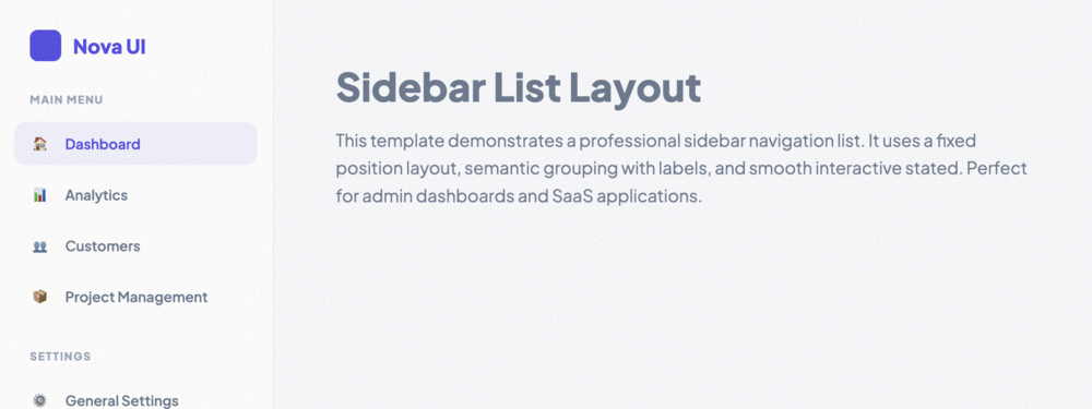
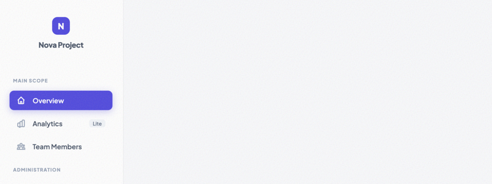
Sidebar List Layout
A professional SaaS-style sidebar navigation list with support for grouping, labels, and beautiful i...
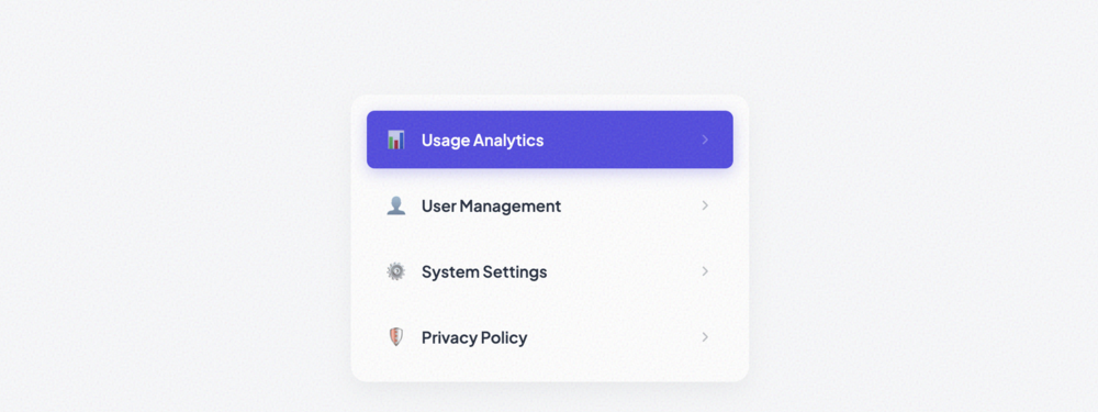
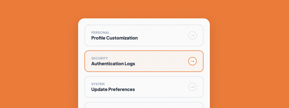
Clickable Navigation List
A refined vertical list optimized for secondary navigation. Includes hover translations, active stat...
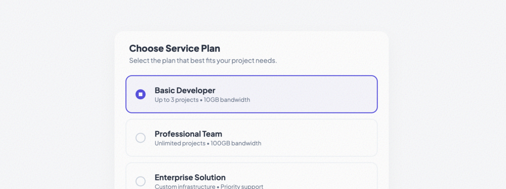
Selectable List
A single-selection interactive list featuring custom radio-style indicators and high-focus selection...
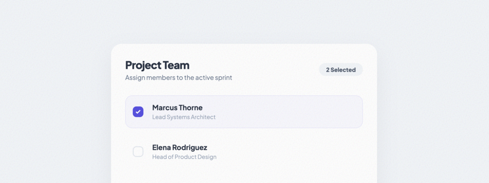
Multi-Select List
A multi-selection list with custom checkboxes and a dynamic counter tracking selection quantity.
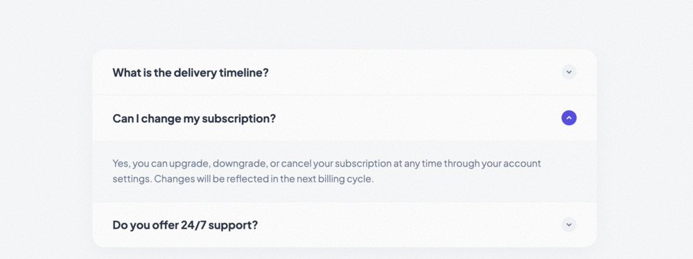
Expandable List
A high-fidelity accordion list with smooth height transitions and interactive rotating toggle indica...
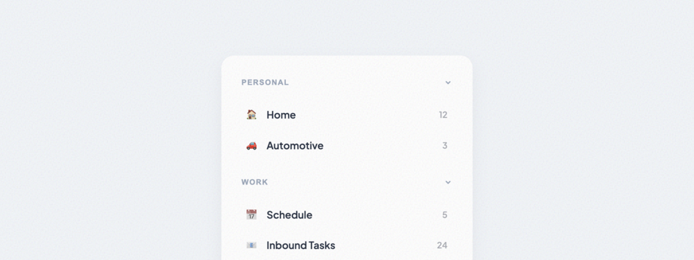
Collapsible Section List
Grouped content list with collapsible section headers. Ideal for complex sidebars or categorized set...
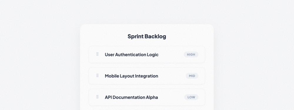
Drag-and-Drop Sortable List
A fully functional sortable list using native HTML5 Drag and Drop API. Perfect for backlogs and prio...
Vertical Navigation List
A standard vertical navigation list with support for nested sub-menus and active state indicators.
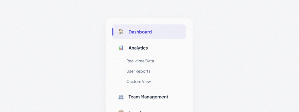
Sidebar Menu List
A professional sidebar menu optimized for administrative dashboards. Includes category labels and ri...

Dropdown Menu List
A refined, high-density dropdown list featuring item dividers and dedicated danger zones.
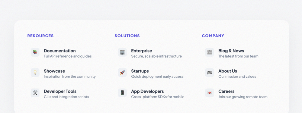
Mega Menu List
An extensive multi-column list structure designed for large mega menus. Includes descriptive items a...
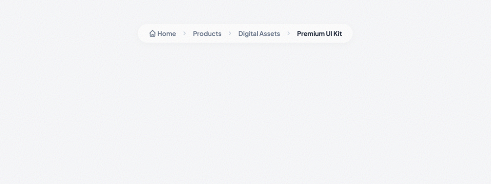
Breadcrumb List
A professional breadcrumb navigation list with custom separators and active state highlighting.
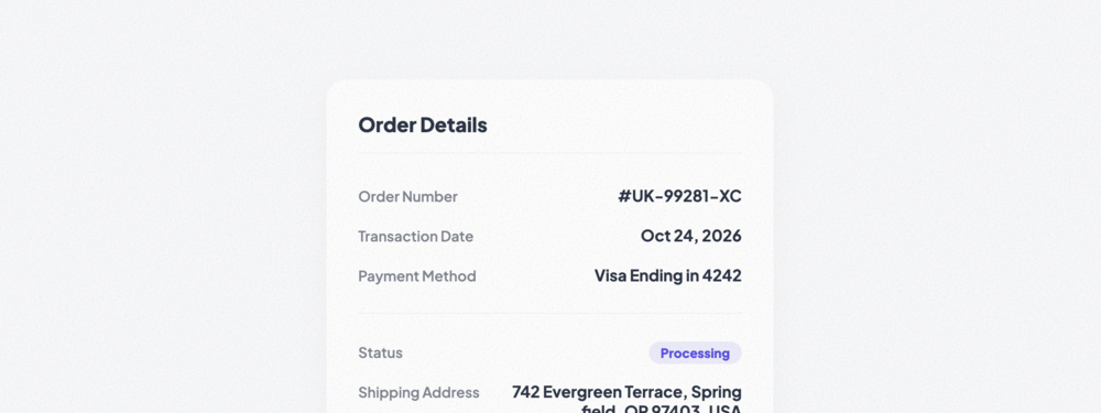
Key-Value Pair List
A vertical list of label-value pairs with clean alignment and status indicators. Perfect for order s...
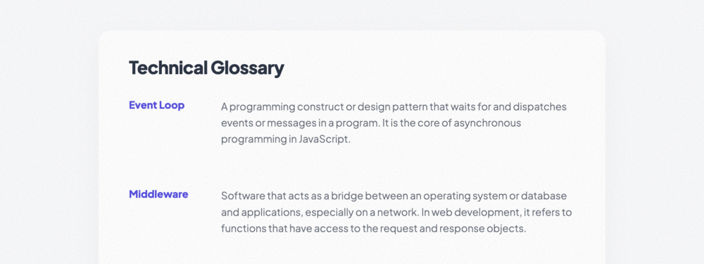
Definition List Layout
A semantic grid-based layout for term definitions. Features a clean multi-column desktop view that c...
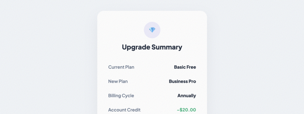
Summary List
A focused summary component optimized for billing and checkout interactions. Includes dashed separat...
Compact Data List
A high-density data presentation list. Ideal for displaying technical metadata, system specs, or inv...
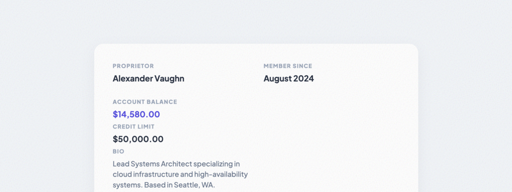
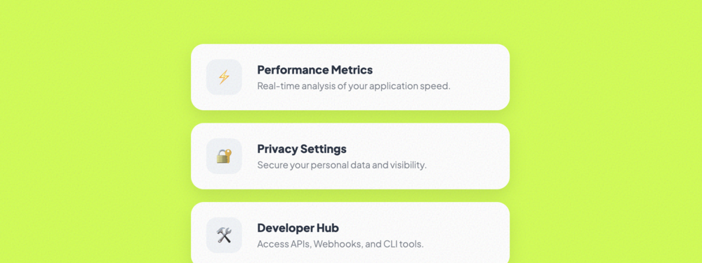
Labeled Info List
A modern grid-based information panel with labels positioned above values. Perfect for profile detai...
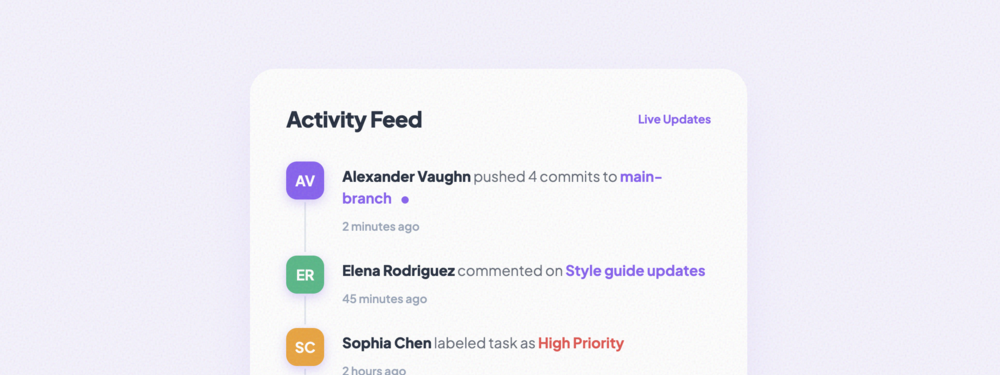
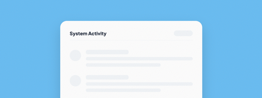
Activity Feed List
A dynamic activity feed with vertical connectors and vibrant status indicators. Perfect for tracking...
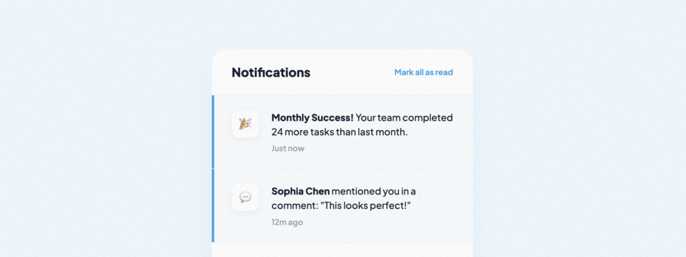
Notification List
An application-style notification center featuring unread state highlights, category icons, and high...
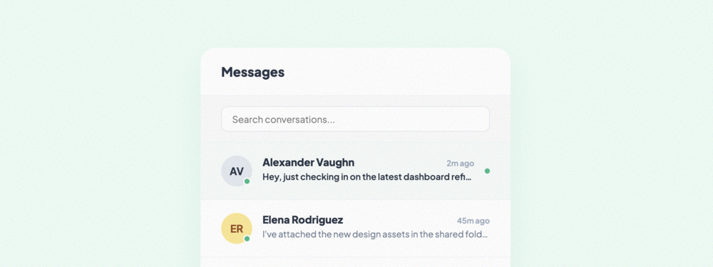
Message Thread List
A professional messaging thread view with online status dots, unread indicators, and overflow-protec...
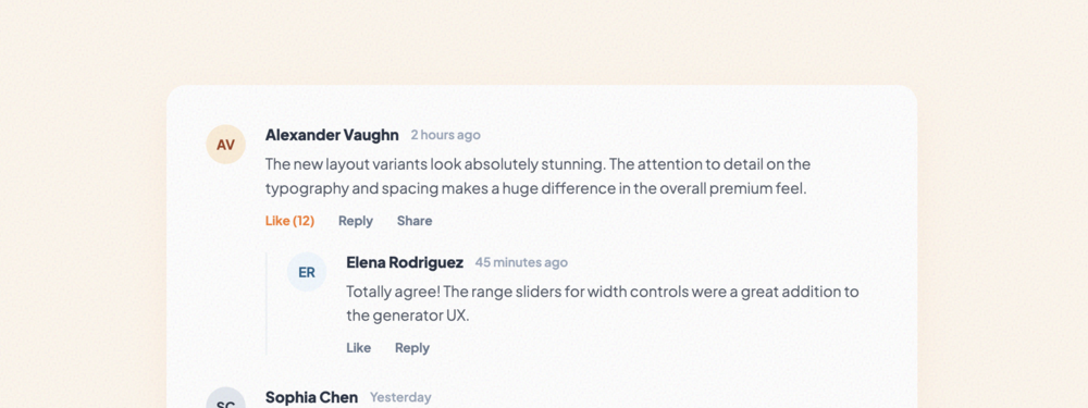
Comment List
A complex threaded comment list supporting nested replies, social action links, and hierarchical dep...
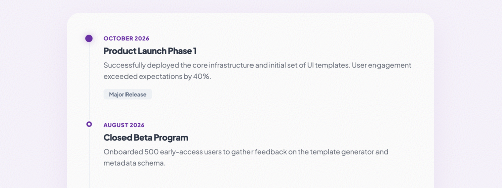
Timeline List
A sleek vertical timeline for historical events or project milestones. Features high-contrast marker...
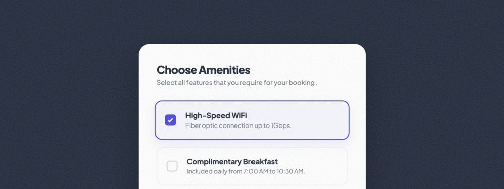
Checkbox List
A modern checkbox selection list with card-based items. Features custom-styled checkmarks and subtle...
Radio Selection List
An elegant single-choice radio list layout. Includes rich descriptions and price-tag support for sub...
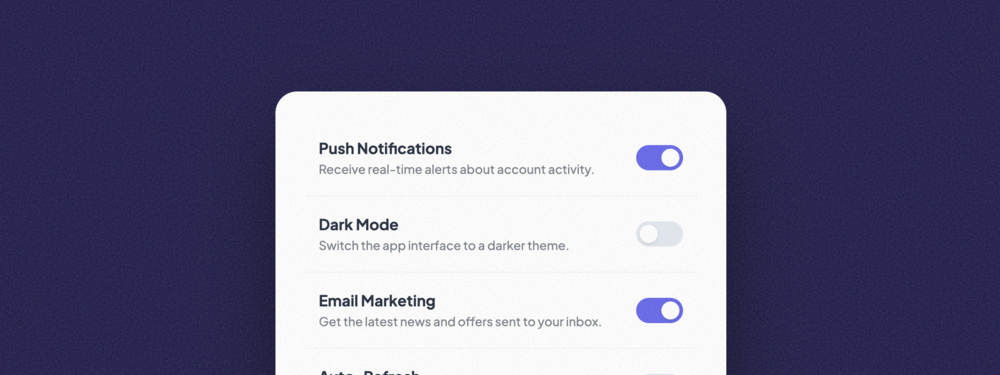
Toggle Option List
A sleek list of settings governed by custom-styled toggle switches. Optimized for system preferences...
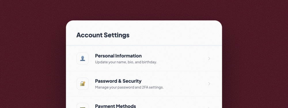
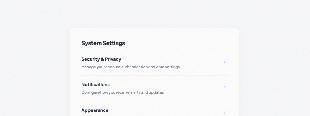
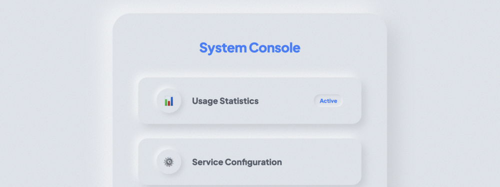
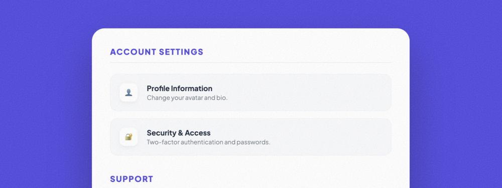
Settings List
A robust mobile-style account settings menu. Features icon-based navigation, hierarchical labels, an...
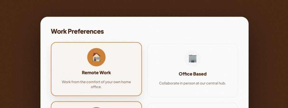
Preference Selection List
A high-impact grid of interactive preference cards. Features icon scaling and card-level selection s...
Minimal Flat List
A focused, geometric list design with no border radius and high-contrast elements. Features smooth i...
Card-Style List
A decoupled list layout where every item is treated as an individual elevated card. Includes rich ic...
Bordered List
A structured list focusing on strong visible boundaries. Features dual-layered labels and interactiv...
Shadowed List
An elevated list using multi-layered soft shadows for deep dimensionality. Includes numeric indexing...
Glassmorphism List
A ultra-modern frosted glass effect list. Uses high-performance backdrop-filters and semi-transparen...
Neumorphism List
A soft-UI list implementing the Neumorphic design aesthetic with dual-shadow extrusion and inset act...
Loading Skeleton List
A high-fidelity loading placeholder with shimmer animations. Used to improve perceived performance d...
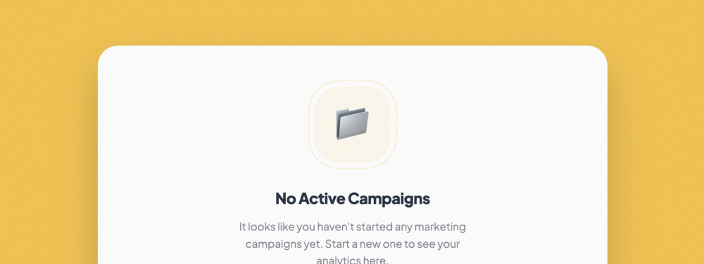
Empty State List
A directive empty state view with illustration support and prominent call-to-action buttons for onbo...
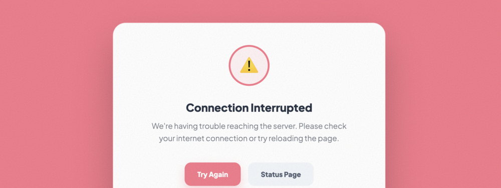
Error State List
A robust failure state component with clear messaging, retry actions, and system error tracking indi...
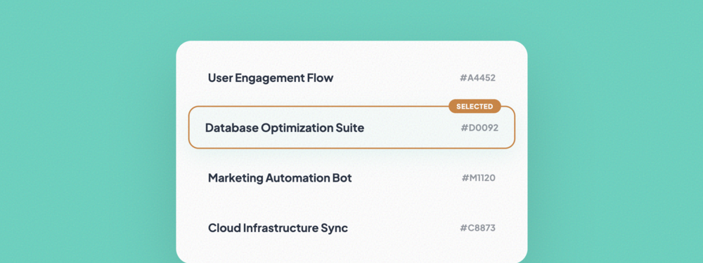
Highlighted Item List
A demonstration of active list selection, featuring Prominent visual cues, scale effects, and condit...
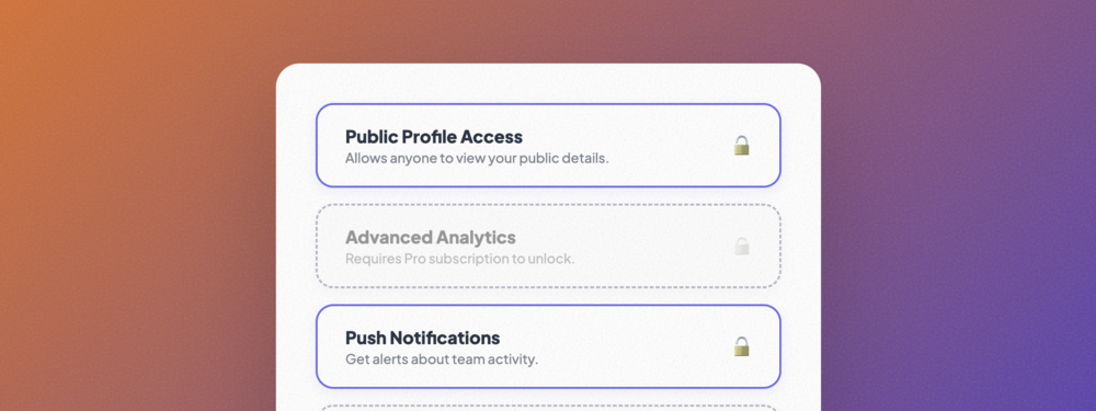
Disabled Item List
Illustrates inactive or restricted states using grayscale filters, dashed borders, and clear status ...
Nested Hierarchy List
A complex multi-level hierarchy with visual connectors and context-aware iconography for deep inform...
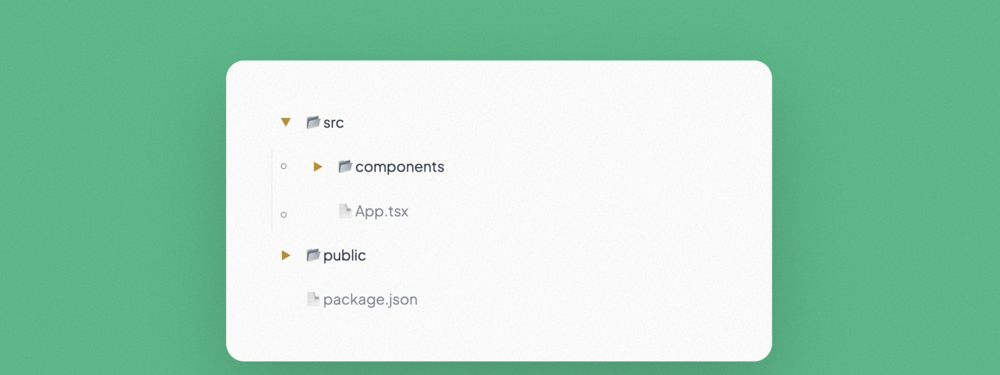
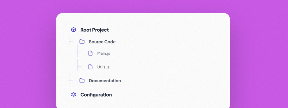
Tree View List
A functional directory-style tree with expandable/collapsible nodes, ideal for file systems or compl...
Grouped Section List
Organizes related information into distinct, module-like sections with prominent headers and clean c...
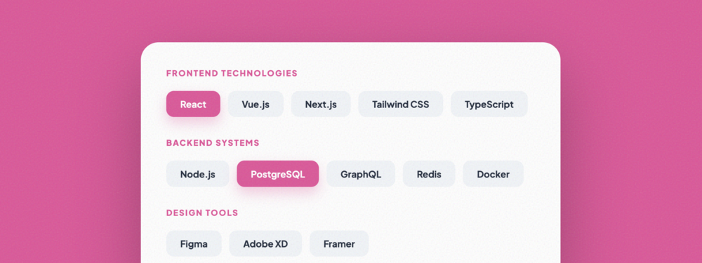
Categorized List
A flexible categorized view using a tag-based layout for efficient filtering and high-density inform...
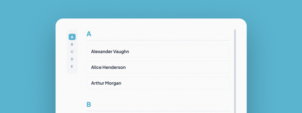
Indexed Alphabetical List
A classic alphabetical directory with a sticky side-navigation index for rapid item discovery and br...
No matching templates found
Try searching for different keywords or styles.