Button Templates - UI Component Library
A collection of high-impact action buttons. Optimized for UX, accessible, and fully customizable for your brand.
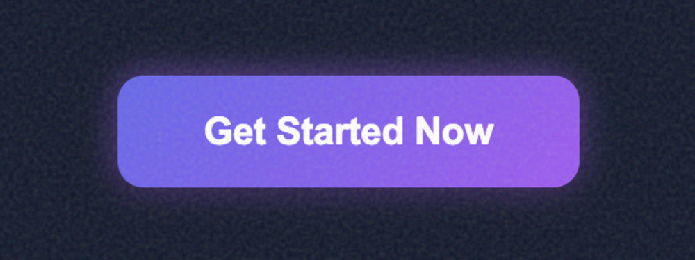
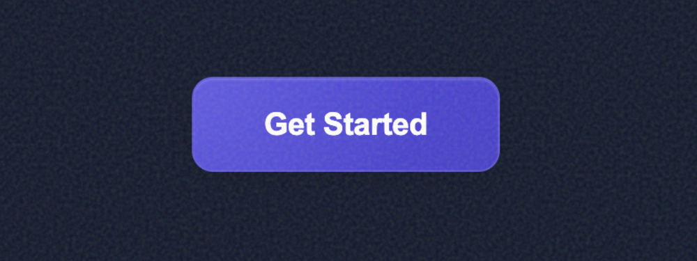
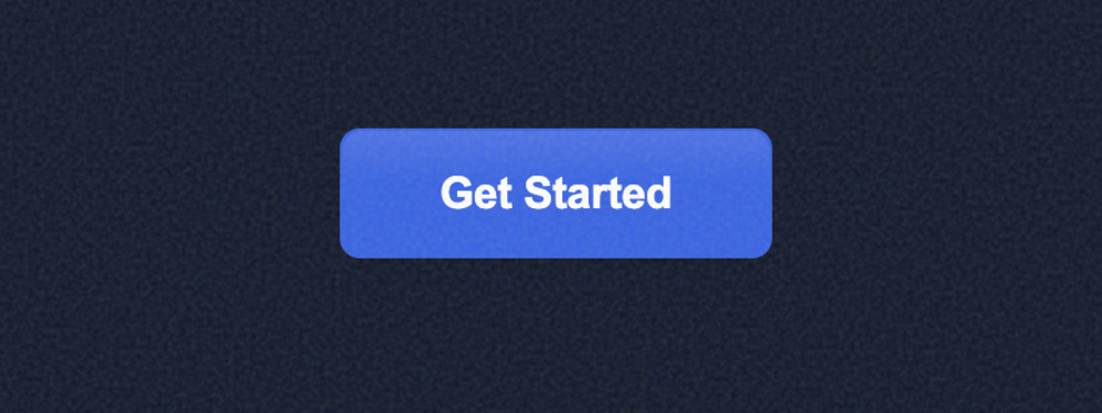
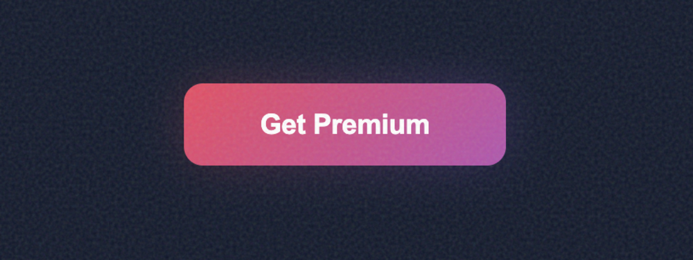
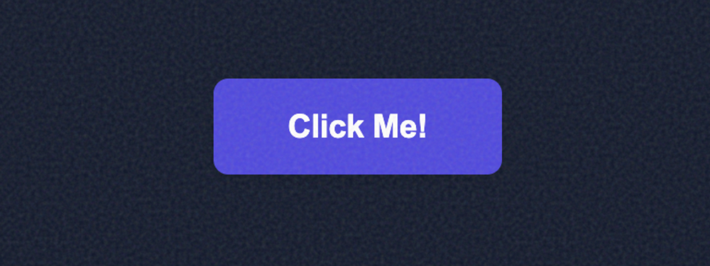
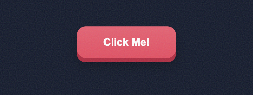
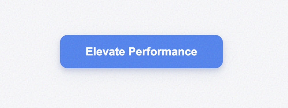
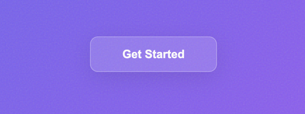
Stellar Primary Button
A high-impact, premium primary action button featuring smooth gradients, dynamic hover lifting, and ...
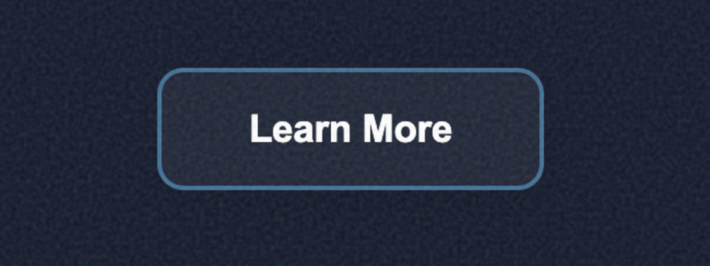
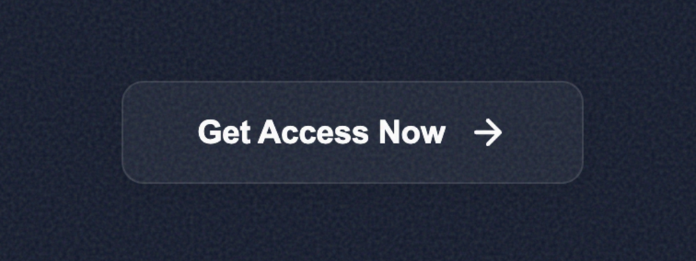
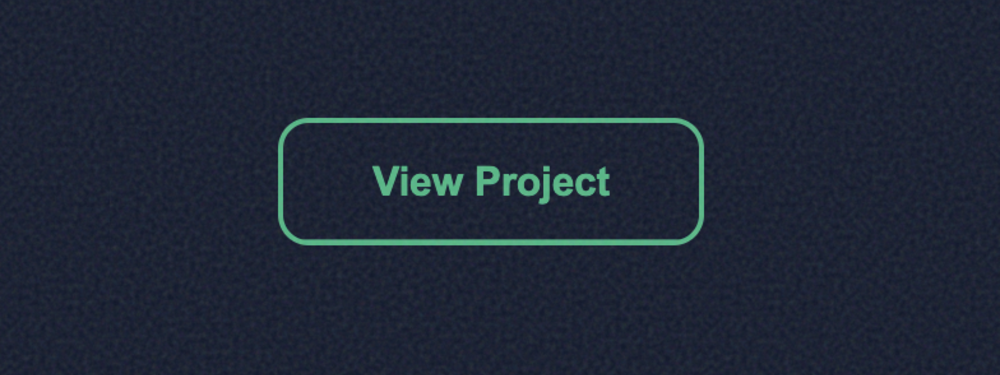
Luminous Ghost Button
A sophisticated secondary action button featuring a delicate luminous outline, glassmorphic surface ...
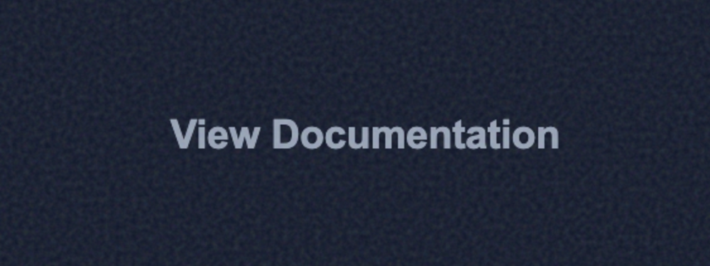
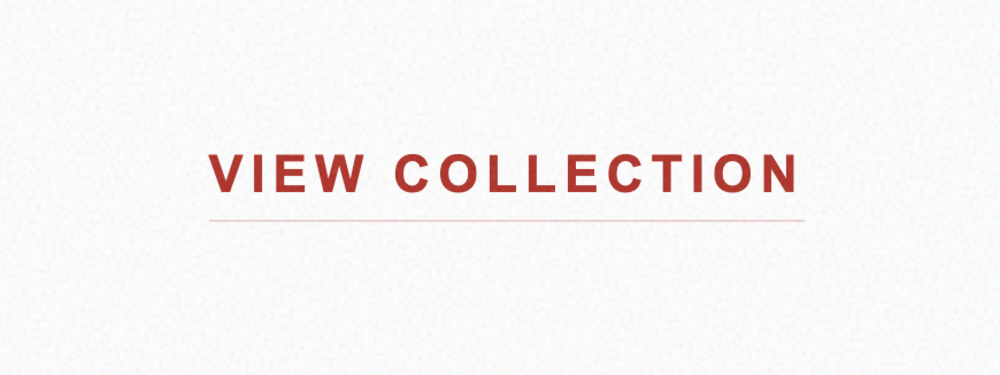
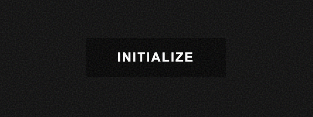
Stellar Text Button
A minimalist text-only button with a kinetic underline effect that grows from the center on hover. I...
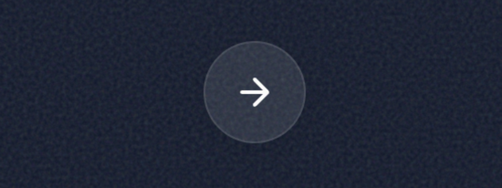
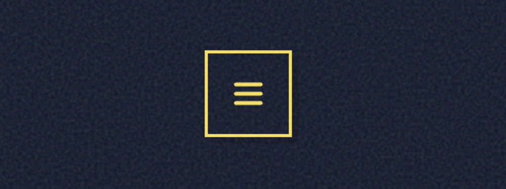
Luminous Orbit Icon Button
A high-fidelity circular icon button featuring glassmorphic transparency, an animated orbital hover ...
Aura Hybrid Button
A premium hybrid button combining flexible vector iconography with high-impact typography. Supports ...
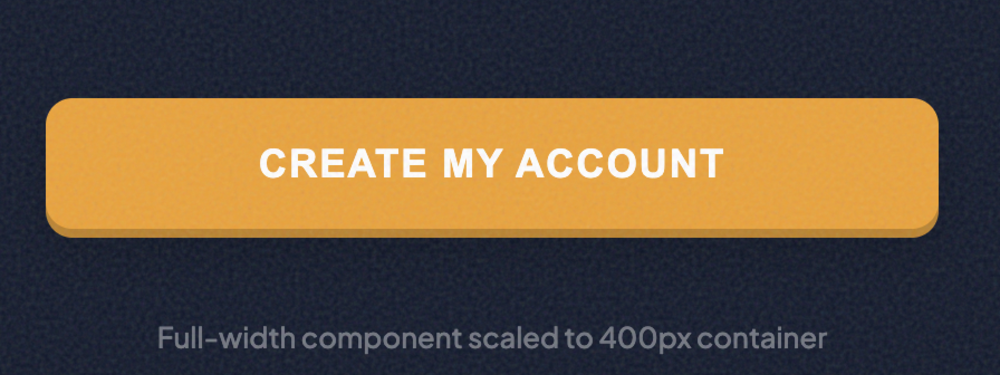
Kinetic Block Button
A powerful full-width action button designed for maximum conversion. Features a tactile 3D feel with...
Aura Micro Button
A refined, high-density micro button designed for tight interfaces and utility actions. Bold typogra...
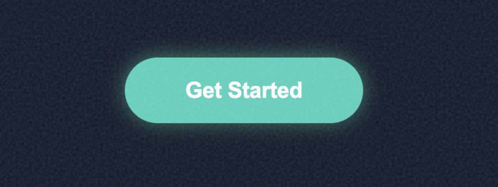
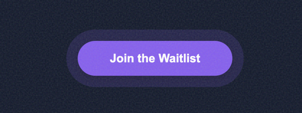
Rounded Pill Button
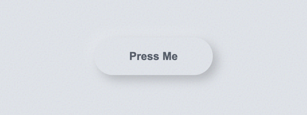
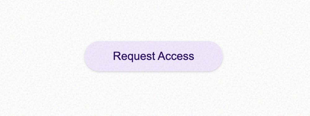
An elegant capsule-shaped button with a fixed pill structure. Features a luminous glow system and a ...
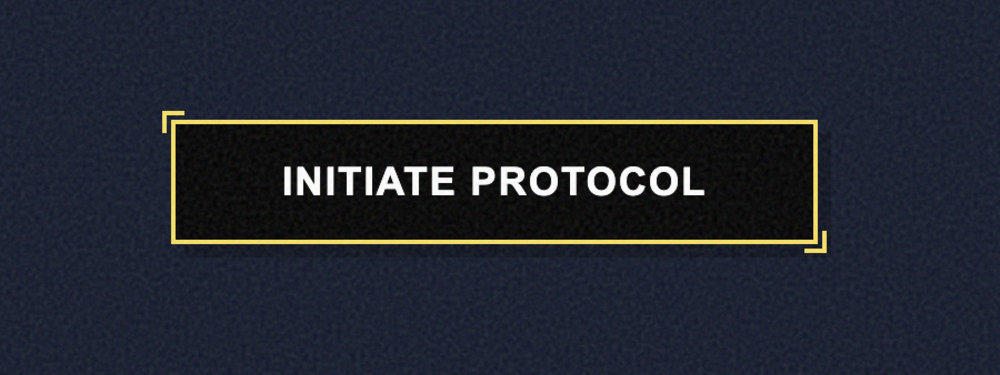
Cyber Sharp Button
A bold, angular button with zero rounding. Perfect for industrial, tech, or brutalist designs. Featu...
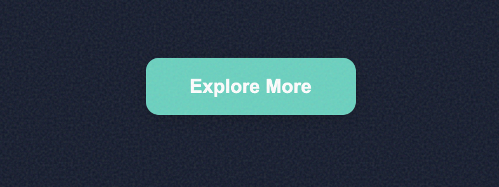
Aura Velvet Button
A friendly and modern button with soft, pleasant corners. Features a sophisticated velvet gradient, ...
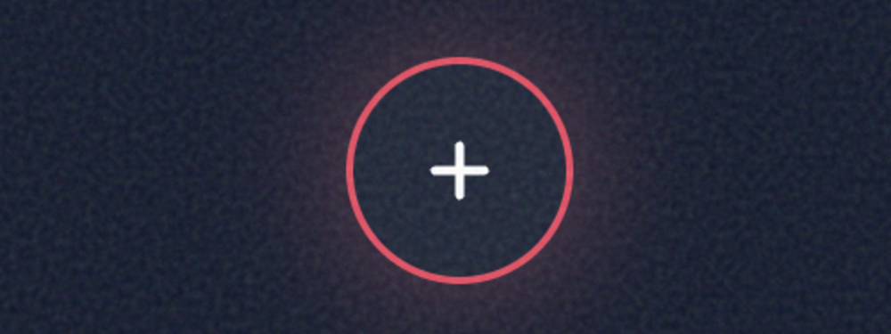
Orbital Pulse Button
A striking circular icon button featuring an animated 'orbital pulse' system. Perfect for primary fl...
Aura Tectonic Button
A sharp, angular icon button with a bold tectonic feel. Features offset depth shadows and a satisfyi...
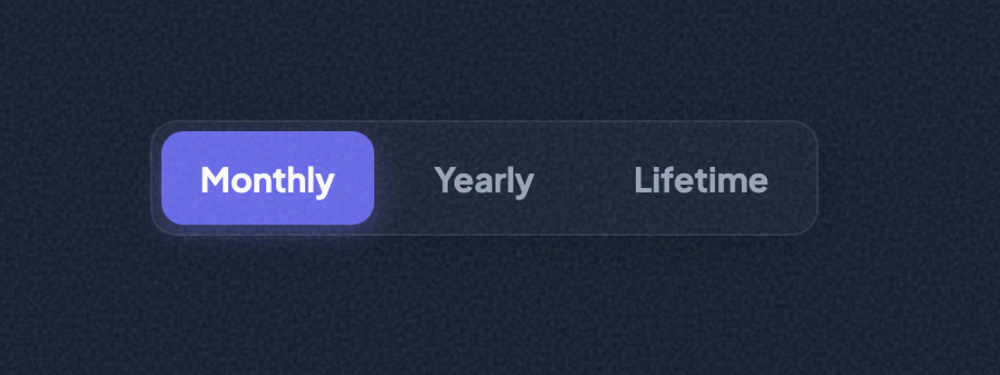
Glass Segmented Control Button
A sophisticated glassmorphic segmented control featuring a smooth sliding active state and 3 customi...
Aura Solid Button
A refined, pure solid-fill button. Features a clean architectural design with subtle inner highlight...
Aura Outline Button
A sharp, minimalist outline button with a sophisticated interactive fill transition. Features adjust...

Aura Ghost Button
A minimalist ghost button that remains subtle until interaction. Features a soft background tint, te...
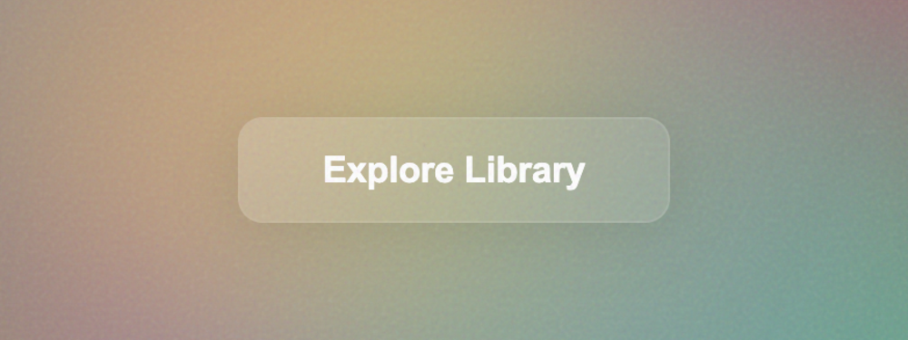
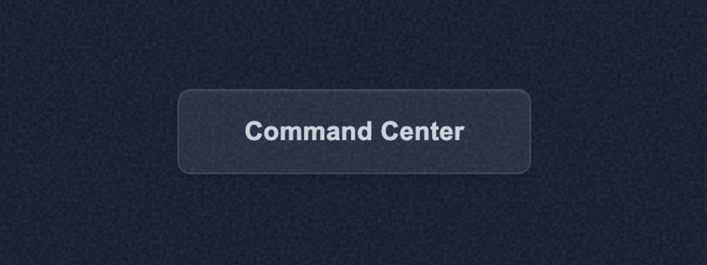
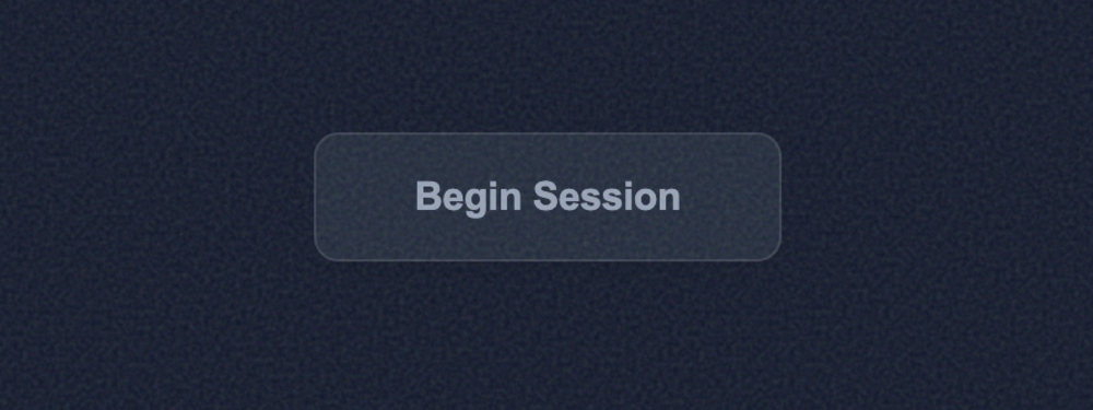
Glassmorphic Transparent Button
A high-fidelity glassmorphic button with adjustable surface transparency and backdrop blur. Perfect ...
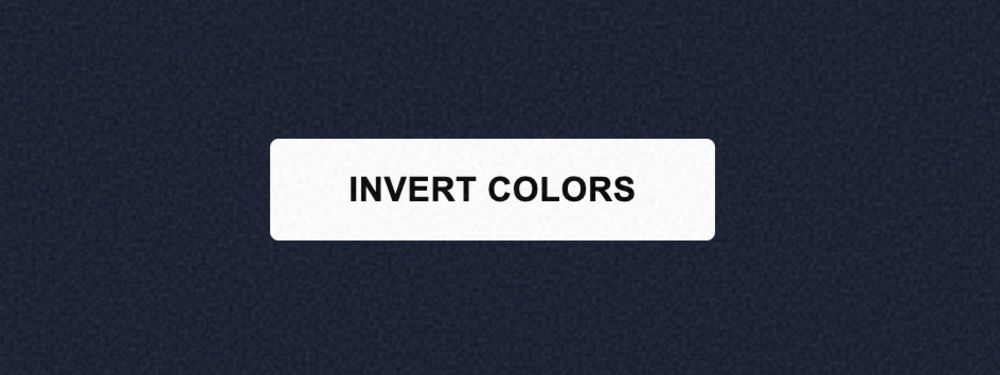
Aura Inverted Button
A high-impact, high-contrast button that swaps its foreground and background colors on hover. Featur...
Spectrum Gradient Button
A vibrant, multi-color gradient button with an animated hover state. Features a soft atmospheric glo...
Slate Monochrome Button
A sophisticated single-color button focusing on depth, texture, and architectural precision. Feature...
Aura Duotone Button
A high-contrast duotone button featuring kinetic horizontal motion and a satisfying offset block sha...
Zenith High-Contrast Button
A high-visibility, neo-brutalist button designed for accessibility and maximum impact. Features heav...
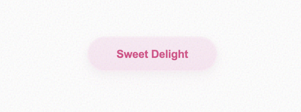
Soft Sorbet Pastel Button
A soft and airy pastel button with a cloudy aesthetic. Features multi-layered desaturated shadows an...
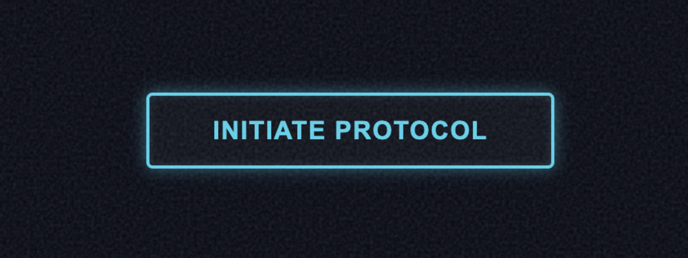
Aura Neon Pulse Button
A high-energy futuristic button featuring customizable neon glows and interactive lighting effects. ...
Aura Fade Hover Button
A sophisticated interaction button focusing on ultra-smooth color transitions. Ideal for professiona...
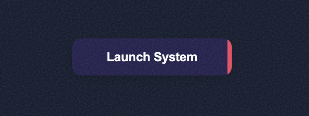
Aura Slide Hover Button
A satisfying kinetic interaction button where a solid background slides into focus on hover. Perfect...
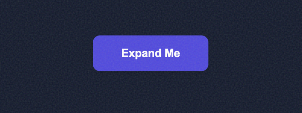
Aura Expand Button
A high-fidelity tactile interaction button that expands with a satisfying bounce on hover. Features ...
Aura Underline Reveal Button
A refined minimalist link-style button featuring a kinetic directional underline reveal. Perfect for...
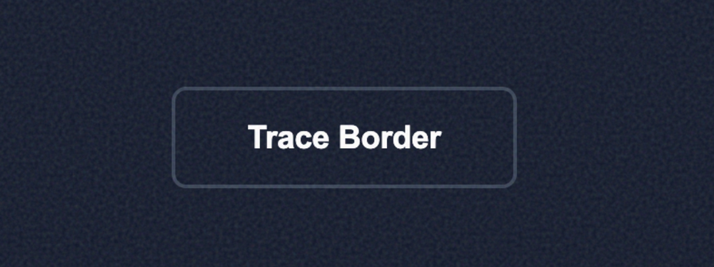
Aura Border Trace Button
A sophisticated interaction button featuring an SVG path that 'traces' the button's perimeter on hov...
Aura Ripple Click Button
A high-fidelity interaction button featuring a Material Design-inspired ripple effect. Spawns an exp...
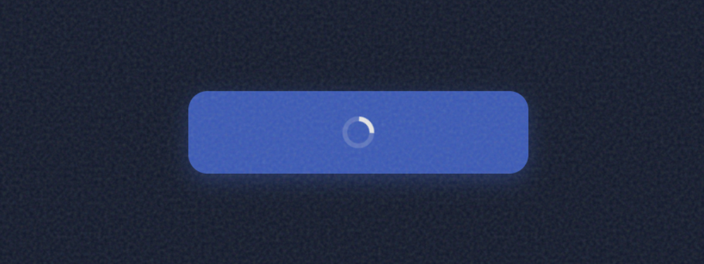
Loading Spinner Button
A professional loading state button featuring a smooth spinner animation and layout transition. Perf...
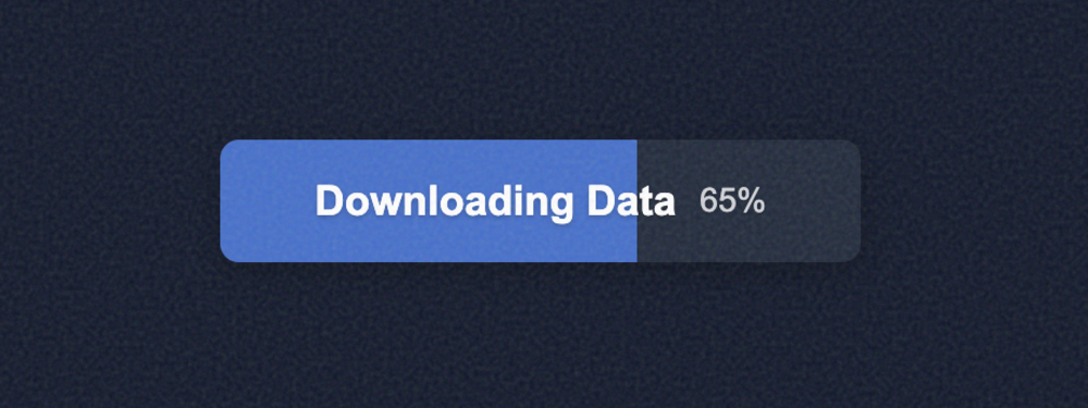
Progress Indicator Button
A high-visibility progress button that fills dynamically based on a percentage value. Includes a sub...
Pulse Animation Button
A high-conversion button featuring a continuous rhythmic pulse animation. Perfect for Call-to-Action...
Bounce Click Button
A playful, tactile button that features a realistic 3D 'squish' effect on click. Uses spring-based C...
Bioluminescent Glow Button
A sophisticated button featuring a 'bioluminescent' breathing glow effect. The aura subtly expands a...
Elastic Morphing Button
A dynamic button that morphs its physical shape and color on hover. Uses a complex cubic-bezier tran...
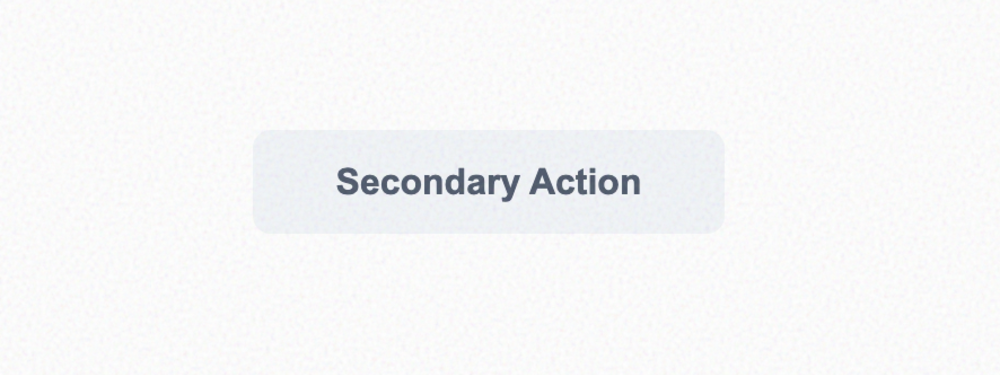
Minimal Flat Button
A clean, distraction-free flat button designed for secondary actions. No shadows or borders, focusin...
High-Elevation Raised Button
A premium elevated button featuring complex multi-layered shadows to simulate realistic depth and ph...
Airy Soft-Shadow Button
A high-end 'airy' button featuring an extremely diffused soft shadow. Perfect for minimalist designs...
Concave Pressed Button
A sophisticated interactive button that uses multiple inset shadows to create a 'pressed' or concave...
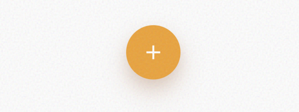
Material Floating Action Button (FAB)
A classic Material Design-inspired circular button that floats above the content. Includes a dynamic...
Glassmorphic Action Button
A sophisticated glassmorphic button that uses backdrop-filter for a realistic frosted glass effect. ...
Soft UI Neumorphic Button
A classic Neumorphic (Soft UI) button that blends seamlessly into its background. Features dual shad...
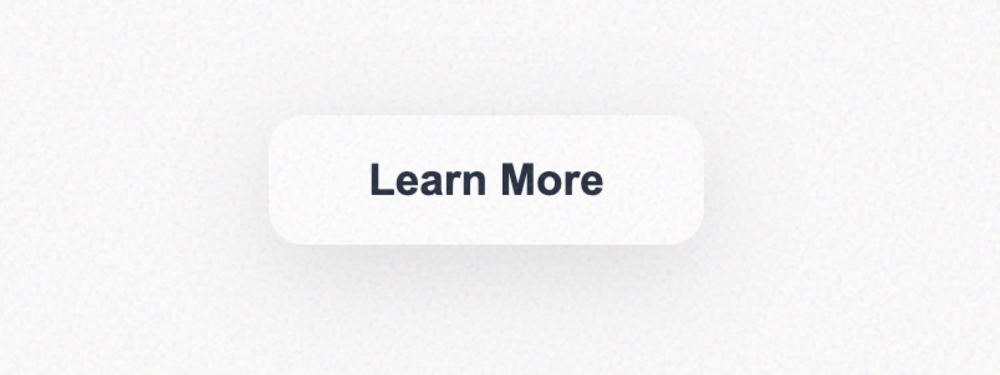
Elegant Minimalist Button
An elegant, typography-focused button. Avoids backgrounds and borders in favor of crisp Inter font a...
Neo-Brutalist Block Button
A high-impact Neo-Brutalist button featuring hard black shadows, thick borders, and vibrant colors. ...
Material 3 Tonal Button
A standard Google Material Design 3 (M3) tonal button. Features a wide corner radius, subtle elevati...
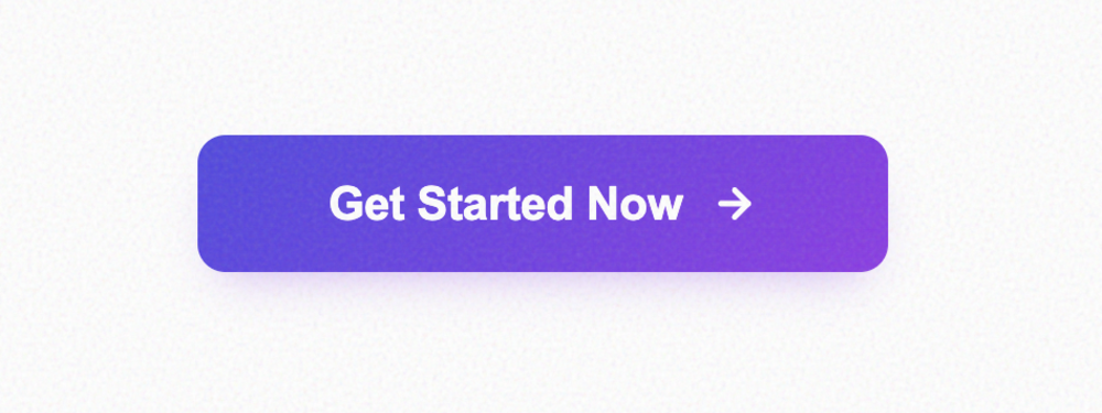
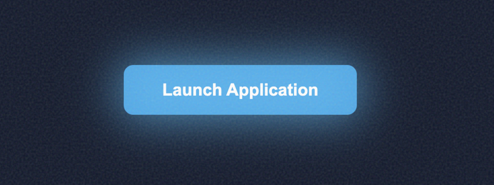
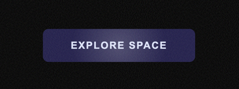
High-Impact CTA Button
A high-conversion CTA button designed for landing pages. Includes a dynamic gradient, ambient glow, ...
Interactive Submit Button
A functional submit button that transforms into a success state upon interaction. Features a vertica...
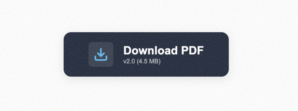
Download Button with Metadata
A specialized button for file downloads. Includes a dedicated icon area with a 'bounce' animation on...
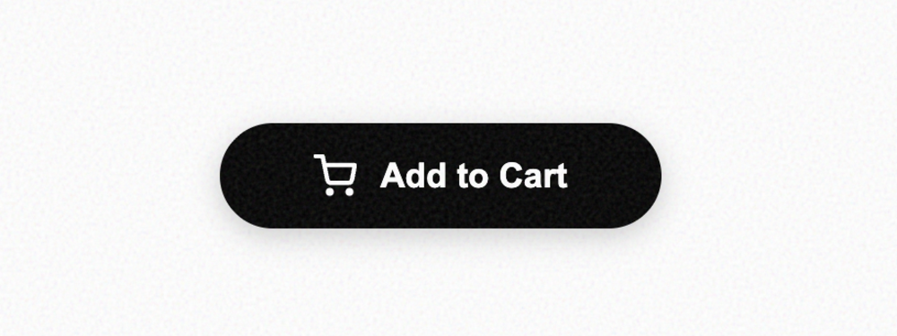
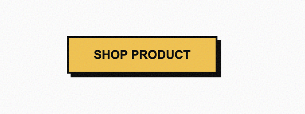
E-commerce Cart Button
A high-conversion shop button. Features an expressive cart icon that scale-rotates on hover and prov...
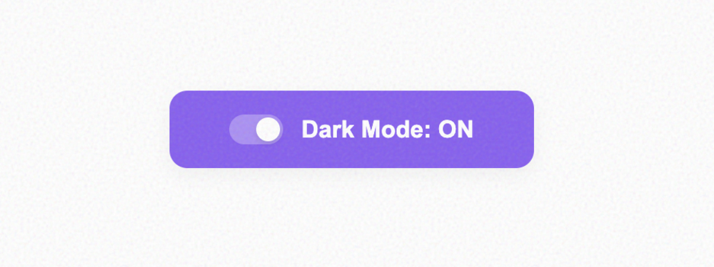
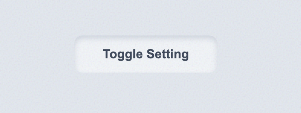
State Toggle Button
A dual-state functional button that behaves like a large switch. Perfect for settings or preferences...
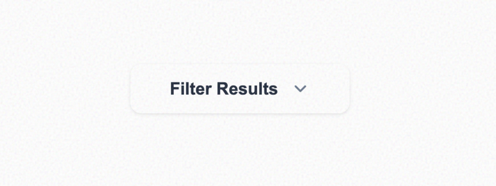
Dropdown Trigger
A standard UI trigger for dropdown menus. Includes a chevron icon that smoothly rotates when the sta...
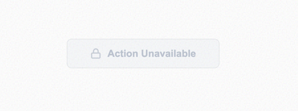
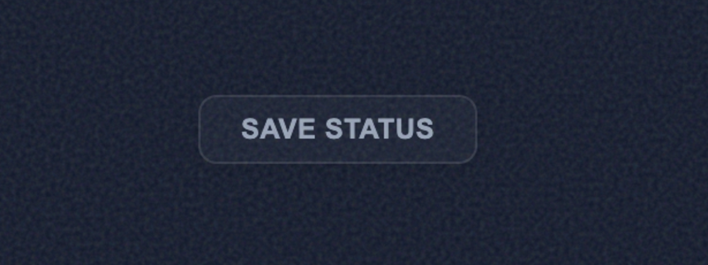
Muted Disabled Button
A correctly styled disabled button. Focuses on low contrast, non-interactive states, and optional fu...
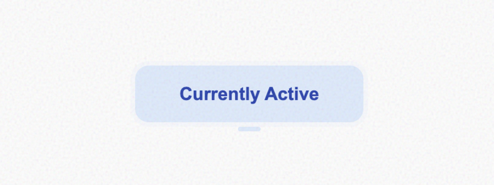
Persistent Active Button
Represents a selected or primary active state. Features a bold highlight ring and a pill-shaped indi...
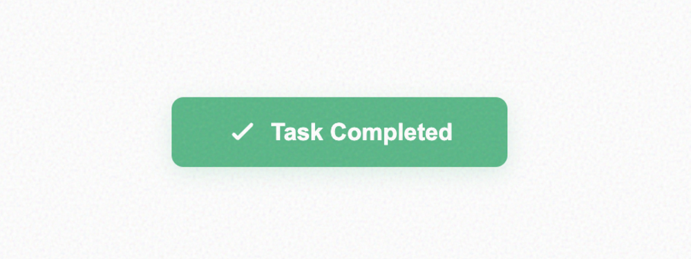
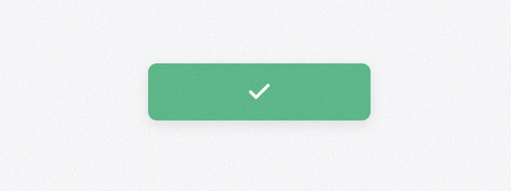
Positive Success Button
A vibrant green button for confirming successful actions. Includes an animated checkmark that draws ...
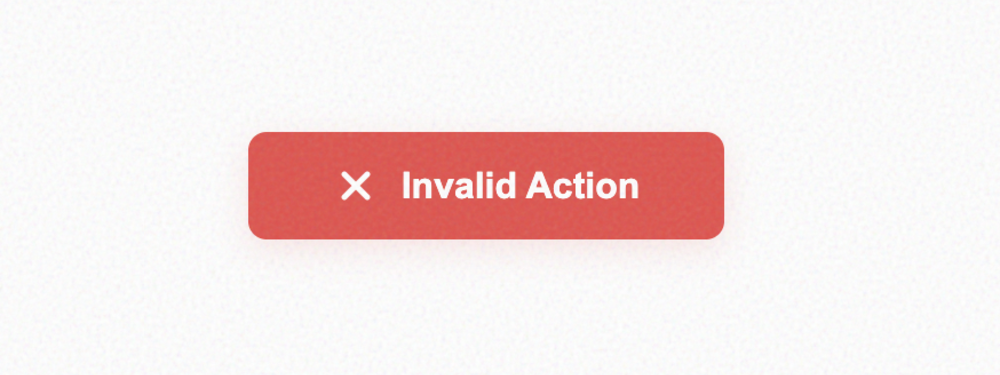
Critical Error Button
A high-visibility red button for dangerous or failed actions. Features an optional haptic shake anim...
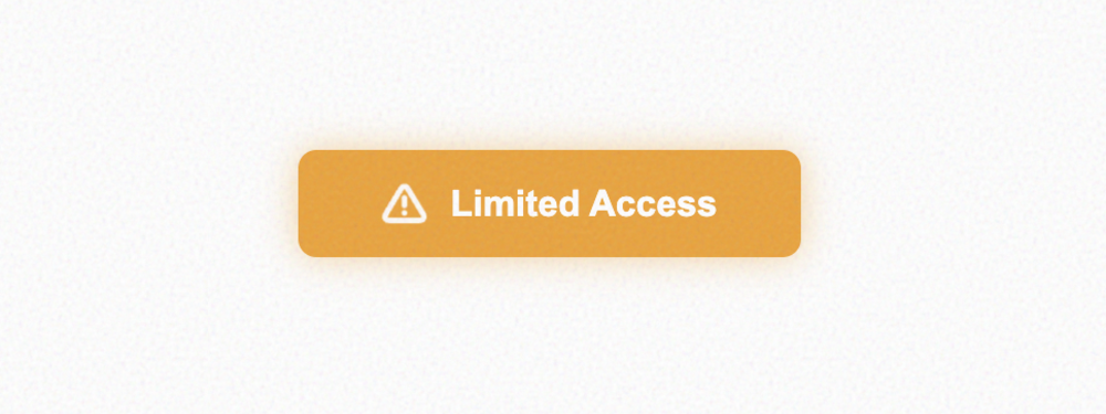
Cautionary Warning Button
An amber/orange button designed for cautionary feedback. Includes a subtle ambient glow and a pulsin...
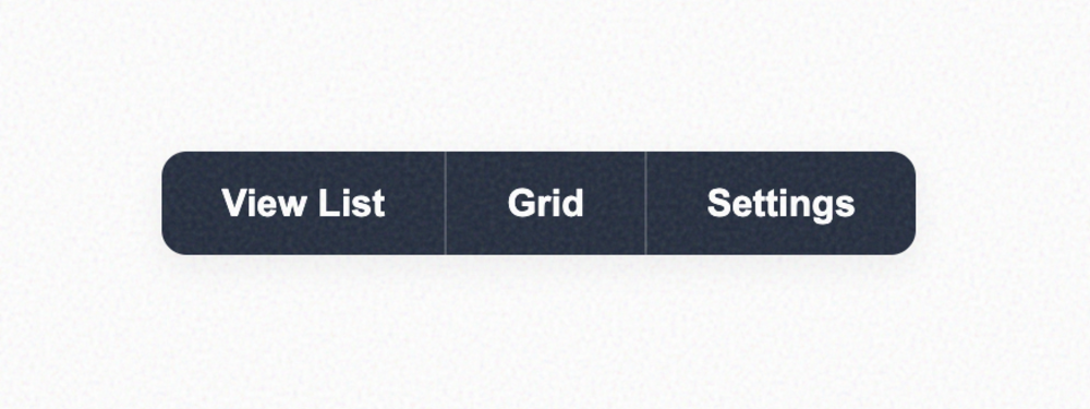
Horizontal Button Group
A set of buttons joined together horizontally. Perfect for toolbars or filtering options. The group ...
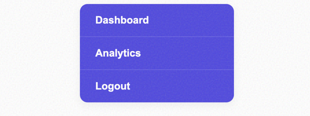
Vertical Button Group
A vertically stacked group of buttons. Ideal for navigation menus or command lists. Includes a subtl...
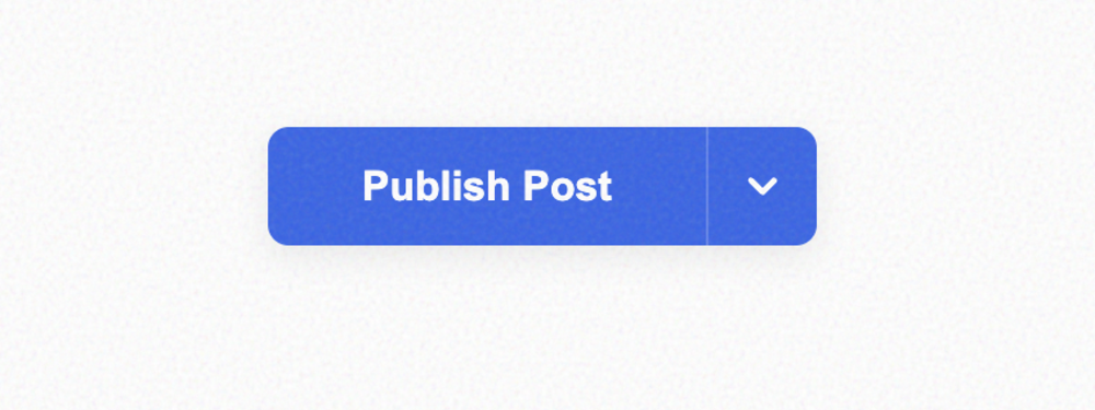
Dual-Action Split Button
A compound button that separates a primary action from a secondary dropdown menu. Features independe...
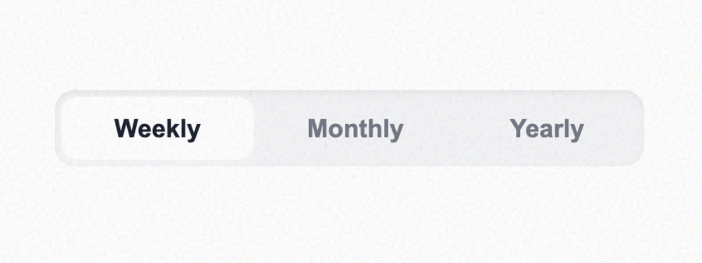
Segmented Control Group Button
A sophisticated segmented control group. One item remains highlighted at all times, making it ideal ...
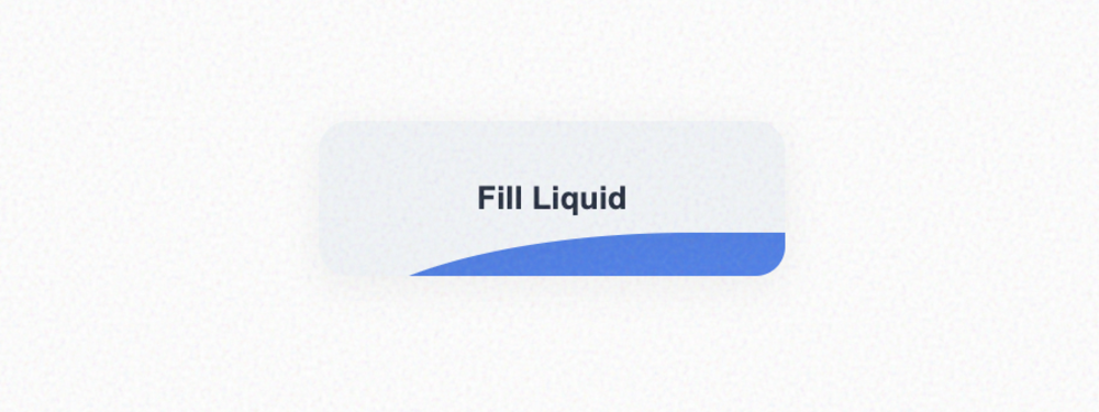
Liquid Fill Effect Button
A stunning visual effect where the button appears to fill with liquid waves on hover. Features high-...
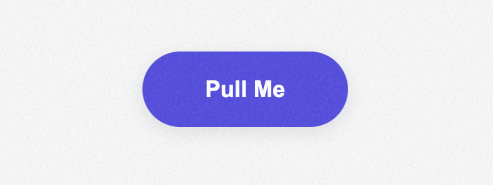
Magnetic Pull Button
An interactive button that is physically 'pulled' toward the user's cursor within a magnetic zone. C...
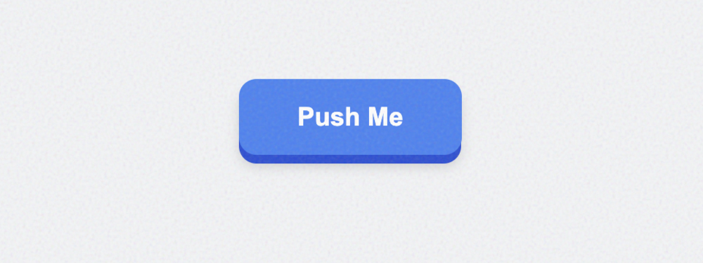
Pushable 3D Button
A retro-inspired 3D button that physically compresses when 'clicked'. Features separate face and sid...
3D Parallax Tilt Button
An immersive card-like button that tilts in 3D space in response to mouse movement. Includes a dynam...
Cyberpunk Glitch Button
Inspired by cyberpunk aesthetics, this button features rapid-slice animations and RGB displacement o...
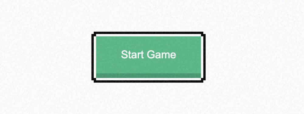
Retro 8-Bit Pixel Button
A pixel-perfect button that uses custom box-shadow stacks to create a stepped, retro border. Comes p...
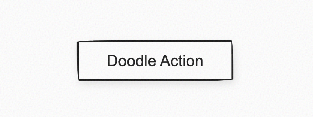
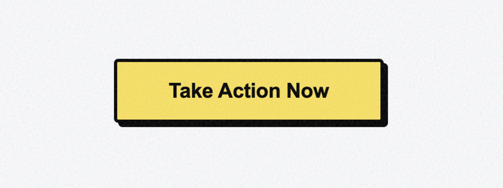
Sketch Hand-Drawn Button
An irregular, organic button that mimics the look of a marker sketch on paper. Features asymmetrical...
No matching templates found
Try searching for different keywords or styles.