List Templates - UI Component Library
A collection of responsive, professional list components. Each template is fully themeable and ready for content integration.
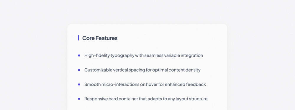
Basic Unordered List
A refined, professional unordered list featuring custom bullet interaction and optional visual divid...
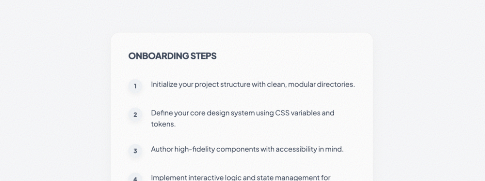
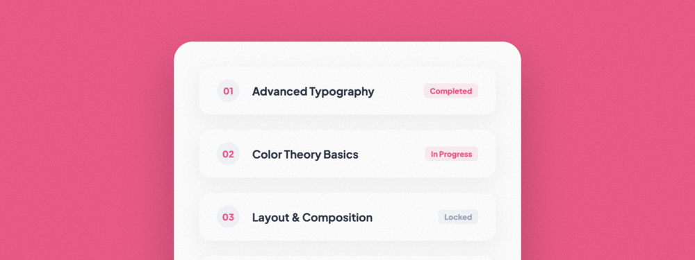
Ordered Numbered List
A professional numbered list featuring custom circular counters with advanced hover transformations.
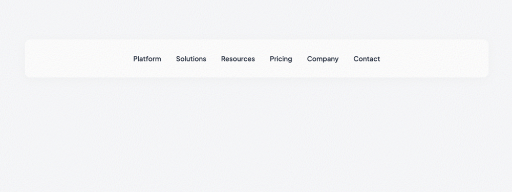
Inline Horizontal List
A flexible horizontal list perfect for secondary navigation, footer links, or horizontally grouped l...
Divider-Separated List
A sophisticated vertical list with clean typographic hierarchy, descriptive subtexts, and customizab...

Bulletless Minimal List
An ultra-minimalist list that relies solely on whitespace and typography for structure. Perfect for ...
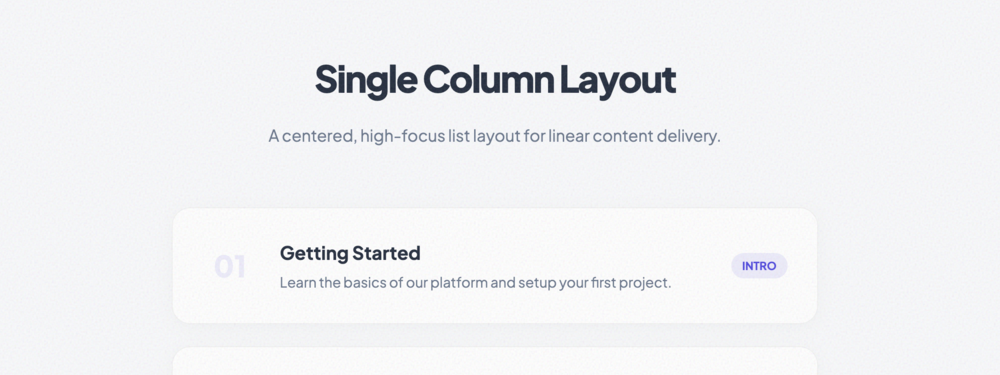
Single Column List
A high-focus single column layout balanced for linear content like tutorials, course modules, or pro...
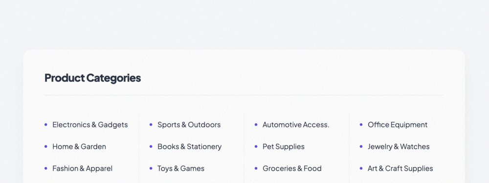
Multi-Column List
Uses CSS columns to automatically balance large lists across multiple vertical tracks. Perfect for s...
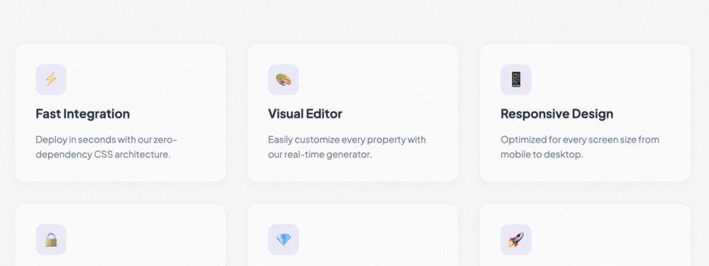
Grid-Based List
A responsive grid of feature-style cards. Each item includes an icon, title, and description area.
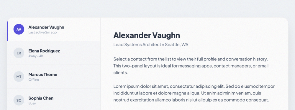
Two-Panel List Layout
A Master-Detail layout inspired by modern messaging and email apps. Features a scrollable list panel...
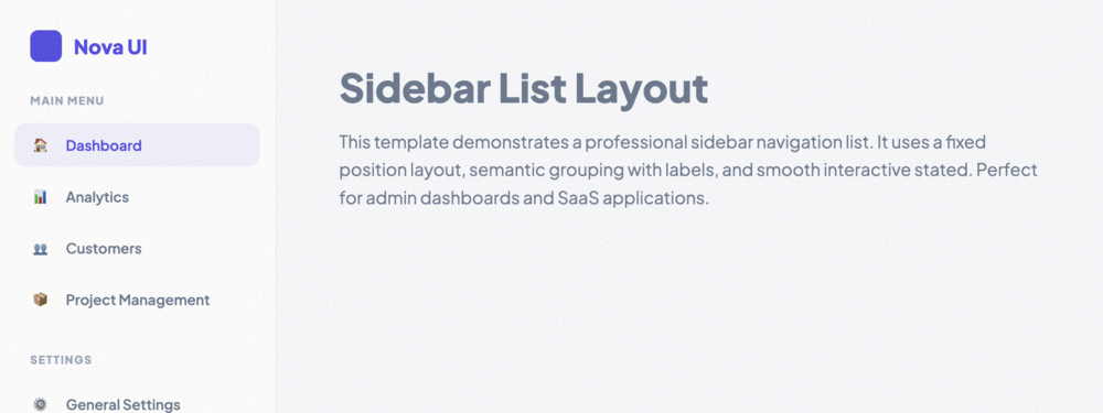
Sidebar List Layout
A professional SaaS-style sidebar navigation list with support for grouping, labels, and beautiful i...
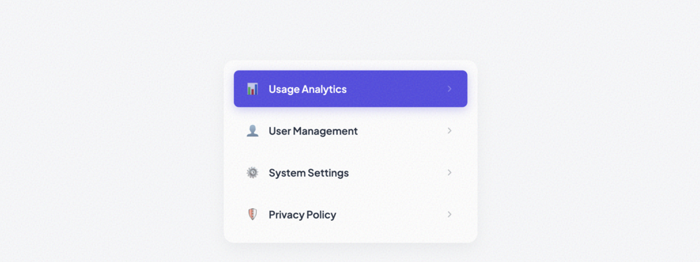
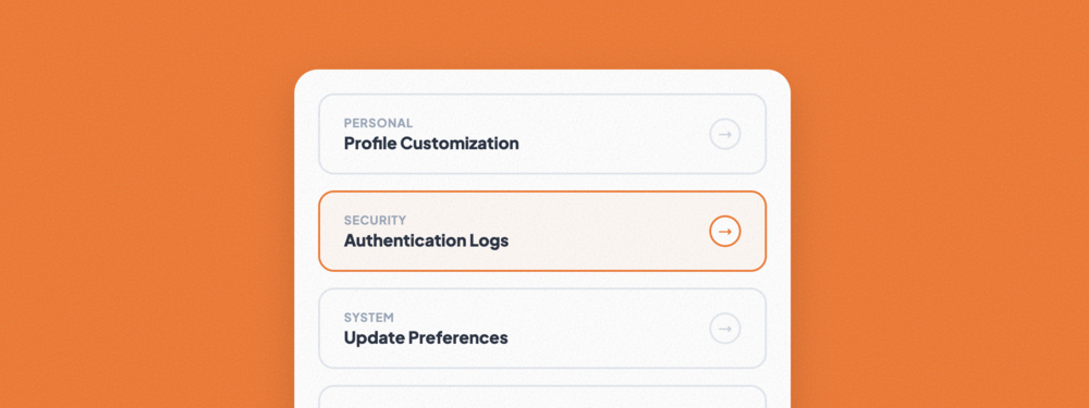
Clickable Navigation List
A refined vertical list optimized for secondary navigation. Includes hover translations, active stat...
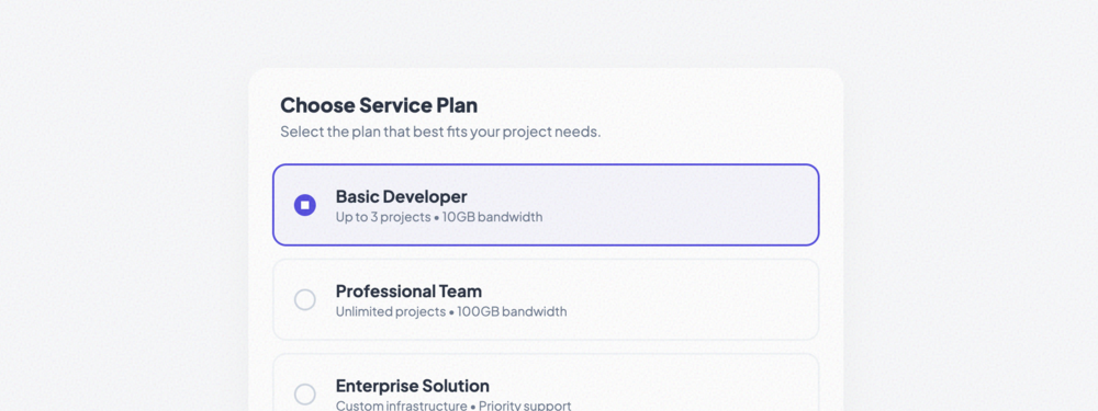
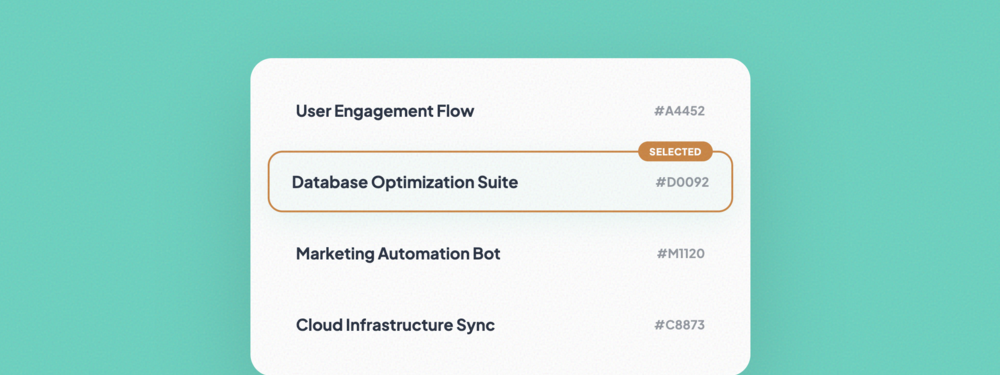
Selectable List
A single-selection interactive list featuring custom radio-style indicators and high-focus selection...
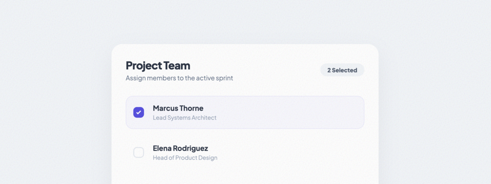
Multi-Select List
A multi-selection list with custom checkboxes and a dynamic counter tracking selection quantity.
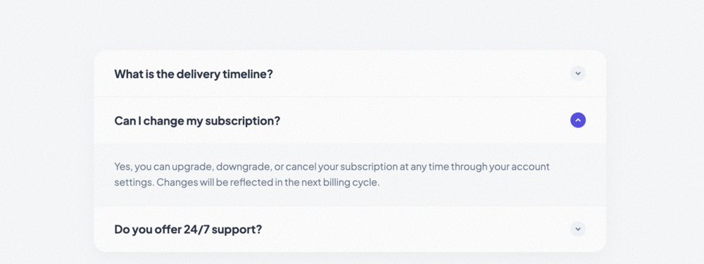
Expandable List
A high-fidelity accordion list with smooth height transitions and interactive rotating toggle indica...
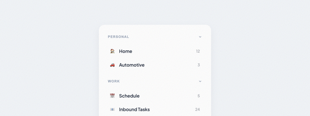
Collapsible Section List
Grouped content list with collapsible section headers. Ideal for complex sidebars or categorized set...
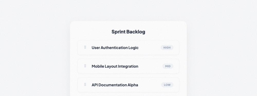
Drag-and-Drop Sortable List
A fully functional sortable list using native HTML5 Drag and Drop API. Perfect for backlogs and prio...

Vertical Navigation List
A standard vertical navigation list with support for nested sub-menus and active state indicators.

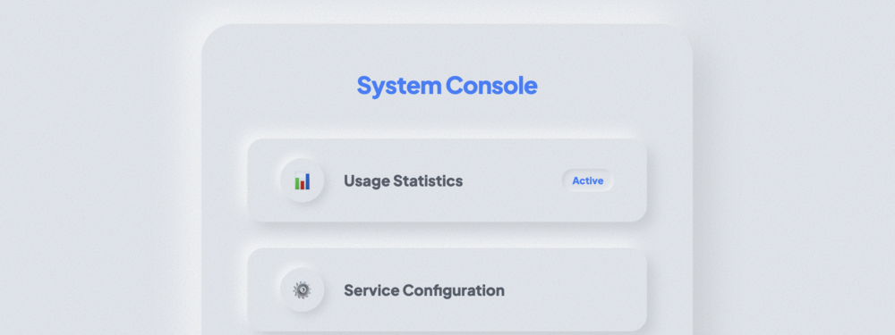
Sidebar Menu List
A professional sidebar menu optimized for administrative dashboards. Includes category labels and ri...

Dropdown Menu List
A refined, high-density dropdown list featuring item dividers and dedicated danger zones.

Mega Menu List
An extensive multi-column list structure designed for large mega menus. Includes descriptive items a...
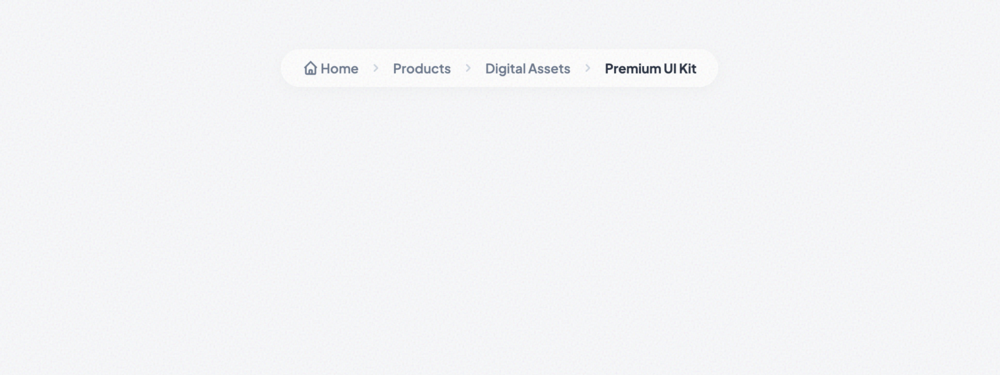
Breadcrumb List
A professional breadcrumb navigation list with custom separators and active state highlighting.
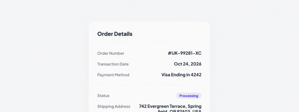
Key-Value Pair List
A vertical list of label-value pairs with clean alignment and status indicators. Perfect for order s...
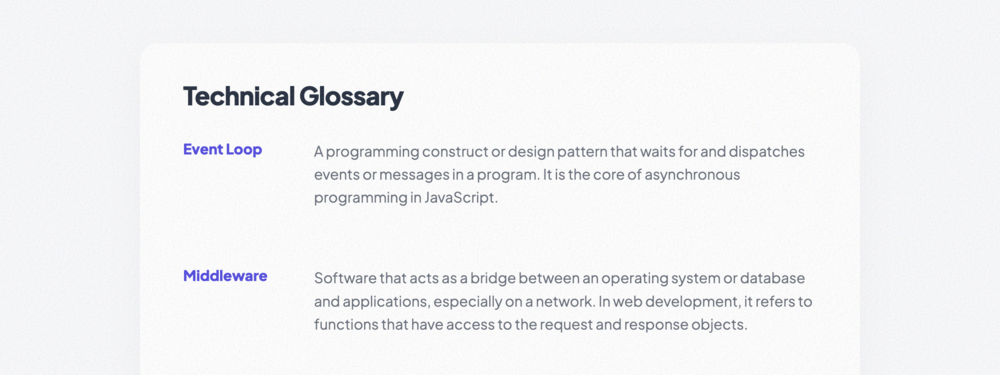
Definition List Layout
A semantic grid-based layout for term definitions. Features a clean multi-column desktop view that c...

Summary List
A focused summary component optimized for billing and checkout interactions. Includes dashed separat...
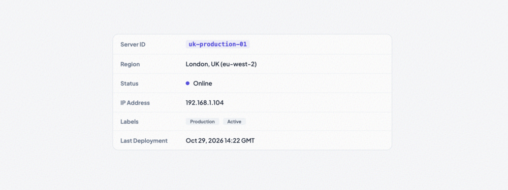
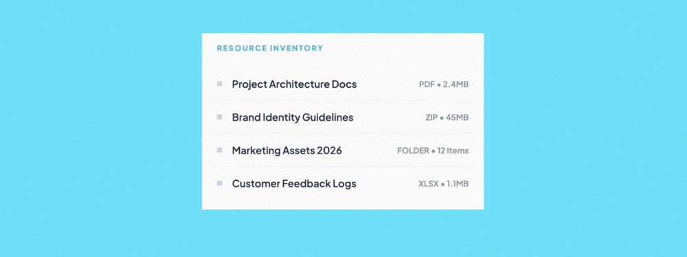
Compact Data List
A high-density data presentation list. Ideal for displaying technical metadata, system specs, or inv...

Labeled Info List
A modern grid-based information panel with labels positioned above values. Perfect for profile detai...
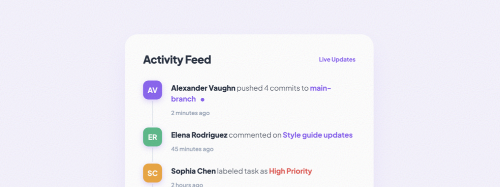
Activity Feed List
A dynamic activity feed with vertical connectors and vibrant status indicators. Perfect for tracking...

Notification List
An application-style notification center featuring unread state highlights, category icons, and high...

Message Thread List
A professional messaging thread view with online status dots, unread indicators, and overflow-protec...
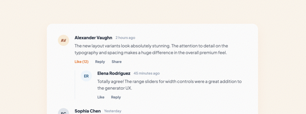
Comment List
A complex threaded comment list supporting nested replies, social action links, and hierarchical dep...
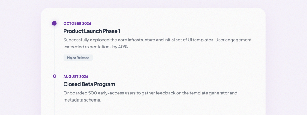
Timeline List
A sleek vertical timeline for historical events or project milestones. Features high-contrast marker...

Checkbox List
A modern checkbox selection list with card-based items. Features custom-styled checkmarks and subtle...
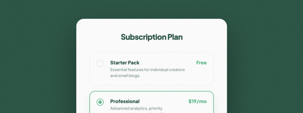
Radio Selection List
An elegant single-choice radio list layout. Includes rich descriptions and price-tag support for sub...

Toggle Option List
A sleek list of settings governed by custom-styled toggle switches. Optimized for system preferences...
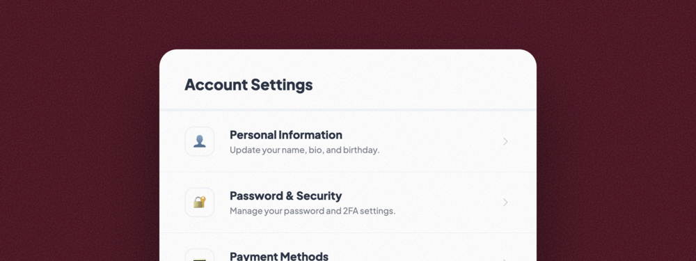
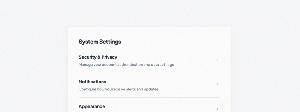
Settings List
A robust mobile-style account settings menu. Features icon-based navigation, hierarchical labels, an...
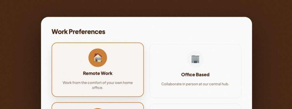
Preference Selection List
A high-impact grid of interactive preference cards. Features icon scaling and card-level selection s...
Minimal Flat List
A focused, geometric list design with no border radius and high-contrast elements. Features smooth i...
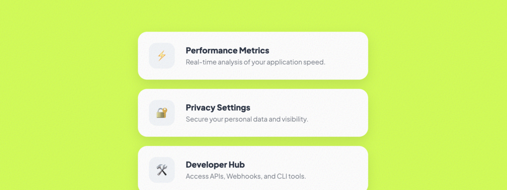
Card-Style List
A decoupled list layout where every item is treated as an individual elevated card. Includes rich ic...
Bordered List
A structured list focusing on strong visible boundaries. Features dual-layered labels and interactiv...
Shadowed List
An elevated list using multi-layered soft shadows for deep dimensionality. Includes numeric indexing...

Glassmorphism List
A ultra-modern frosted glass effect list. Uses high-performance backdrop-filters and semi-transparen...
Neumorphism List
A soft-UI list implementing the Neumorphic design aesthetic with dual-shadow extrusion and inset act...

Loading Skeleton List
A high-fidelity loading placeholder with shimmer animations. Used to improve perceived performance d...

Empty State List
A directive empty state view with illustration support and prominent call-to-action buttons for onbo...
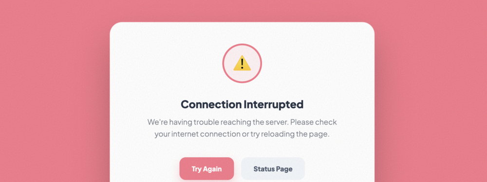
Error State List
A robust failure state component with clear messaging, retry actions, and system error tracking indi...
Highlighted Item List
A demonstration of active list selection, featuring Prominent visual cues, scale effects, and condit...
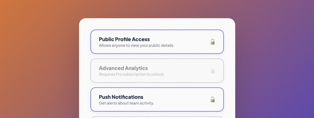
Disabled Item List
Illustrates inactive or restricted states using grayscale filters, dashed borders, and clear status ...
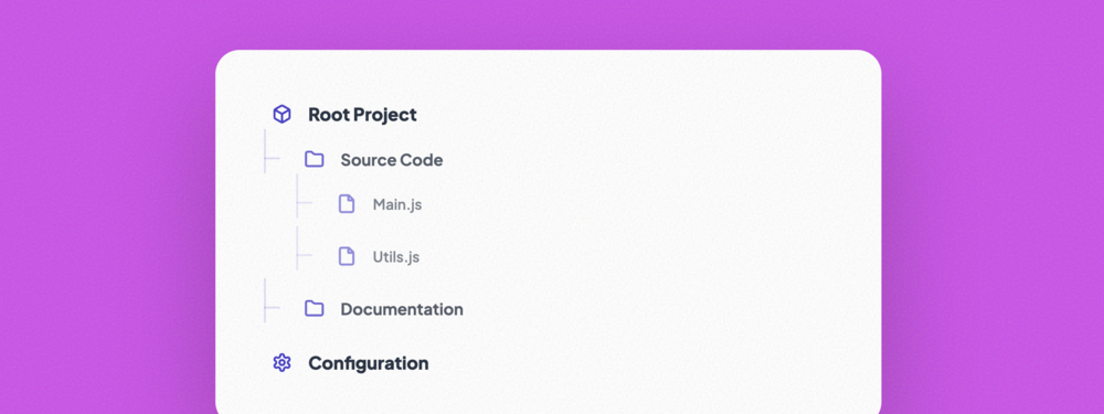
Nested Hierarchy List
A complex multi-level hierarchy with visual connectors and context-aware iconography for deep inform...
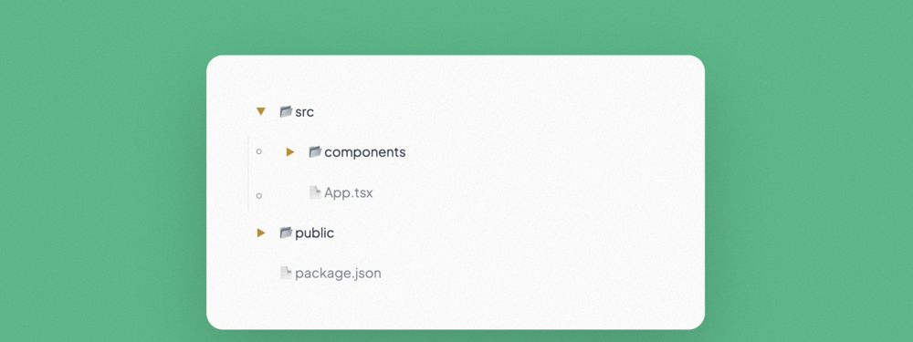
Tree View List
A functional directory-style tree with expandable/collapsible nodes, ideal for file systems or compl...

Grouped Section List
Organizes related information into distinct, module-like sections with prominent headers and clean c...
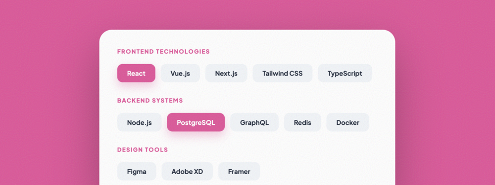
Categorized List
A flexible categorized view using a tag-based layout for efficient filtering and high-density inform...
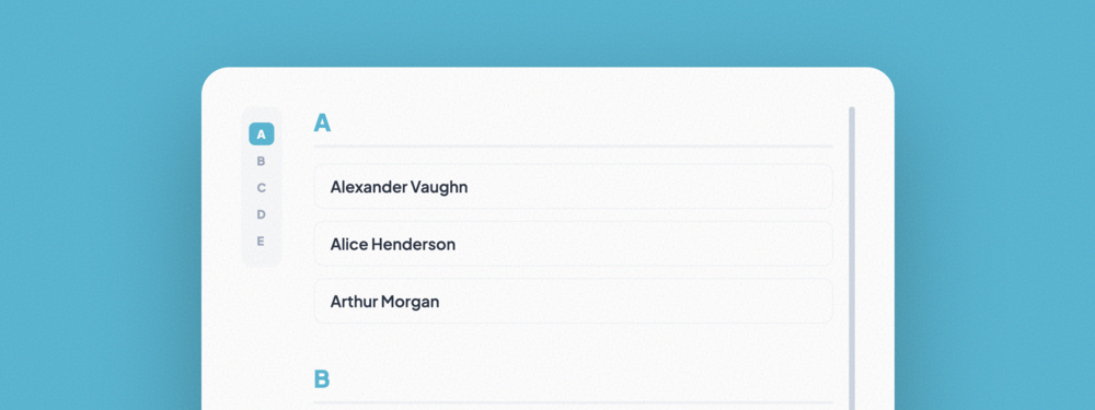
Indexed Alphabetical List
A classic alphabetical directory with a sticky side-navigation index for rapid item discovery and br...
No matching templates found
Try searching for different keywords or styles.